Showing posts with label ads. Show all posts

3.10.2011

MTA FAIL... AGAIN


Well it looks like the MTA has finally caught up to 1988. They are currently installing digital signs that indicate when the next trains will arrive.

Problem #1: The extra "1." before the actual train number (1) is unnecessary. It is superfluous since the list is so short that we do not need numbering. Plus it is visually confusing to have the numbering next to trains that themselves are numbered.

Problem #2: The LED dot matrix display is up to date... in 1988. The point of using the flip-dot display is to use on large (no) outdoor (no) signs that usually will be exposed to direct sunlight (no).

Problem #3: Sometimes they are wrong.

2.22.2011

INFORMATION DESIGN FINDS PROFITS


Finally a way to make money from information design. A big problem in the field has been financing since the private sector has largely ignored the value of data visualizations. But now a company called Column Five Media has injected PR into the mix so as to position information design as an asset since it comes with press and guaranteed brand impressions. So now companies like TurboTax are using good design as a way of advertising by giving consumers valuable information. Pretty fucking smart.

2.09.2011

MTA CHUTZPAH


Copy: "Instead of developing transit apps ourselves, we gave our info to the people who do it best."

Now if only they would lend some of that improvement to the G train. It would be easy because every single thing about that train needs help.

10.26.2010

CREATIVITY IS KEY


In the world of in-store bulletin boards, a creative execution really stands out. Such as this ad we reviewed last year. Here, the piano tuner exploits the product's appearance by visually linking it to the take-away in a mostly successful ad. Additionally, leaving out names lets the company name do the talking, which gives it credibility and legitimacy in a media space where anyone could tape up a flyer. The typeface party on the other hand...

4.27.2010

GET OFF THE PHONE

Copy: "Don't talk while he drives"

This print ad for the Bangalore Traffic Police created by the Mudra Group in India is a refreshing new angle on the effect that the product/problem has on its participants. A public awareness ad could communicate a common formula like: "if you talk on the phone while driving, this bad thing will happen to you." Or, as this ad does, it could communicate: "if you talk on the phone while driving, this bad thing will happen to the person you're talking to." We are reminded that car accidents resulting from distracted drivers are not just the fault of the driver.

The concept is good because it is unexpected. However, the art direction could use more work in composition and staging. The desaturated tones of the image allow the red blood to stand out, but the blood itself could use an increased level of gore by being a bit heavier and thicker, maybe even with some clots, since it looks like thin paint as it is now. Compositionally, the diagonals of the blood line, the arm, and the side of the woman's body effectively guide the eye from the focal point of the phone. The only problem is that the woman seems distorted from the angle of her head, as the hairline is uneven and is shaped to make the head appear elongated. It is really is quite annoying once you notice it. Also, her expression could use a touch of disgust. Check out this other execution in the same campaign.

3.17.2010

HOLY MISE-EN-SCENE

This stop-motion animation-style video by the director "Pes" (a.k.a. Adam Pesapane) for the Washington State Lottery is delicious. The colours are so luscious and the palettes of each scene are harmonious in their simplicity. Also, this video is a great example of reappropriation (one of the post-modern principles of art) in its utilization of everyday objects as landscape settings and props. For example, white rubber gloves as snow on the mountain, pine cones as trees, and lunch box as barn.

11.11.2009

AN ALTERNATE EMPLOYMENT OPTION

Source: Facebook.com

A not-so-bad take on the excessive use of recession-speak in advertising. Humor is a great way of reaching people and pairing that humor with the usually serious and somber economic relevance communication breaks through in a charming sort of way.

10.29.2009

HTC

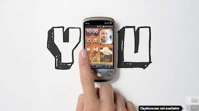
Bad brand name. Good tv spot. It is a good example of how the choice of soundtrack matters so much in making or breaking commercials. Try watching this on mute with a different song in the background. It could have a cheesy tone by being set to "Chain Reaction" by Carly Commando like this American Express OPEN tv spot. But it doesn't. This HTC spot has the tone of fast, dramatic, intense, sure, and moving thanks to "Sinnerman" by Nina Simone.

NOT A FLOP

Fitflop print ad. Subway train. 2009.

This ad has a good tagline: "Get a workout while you walk."

It is a pretty compelling print piece. The model in the photo is very thin and is posed in such a way that thins and elongates her legs. Even the diagonal of her blue shirt over the skirt brings the eye upward. Also, we're not distracted by a pretty face since the photo is cut off at the model's neck. The shoe has a unique textured fabric that at once looks rich and lengthens the model's leg because of the backless mule style. The choice of location -- a supermarket -- is a great one because it's a place where everyone goes almost every day and works with the casual style shoe. The headline is as good as the tagline because of its truth and appeal to our inner desire for an easy-as-possible work-out.

9.25.2009

ABSOLUT WORLD

Absolut wild posting. Houston Street, New York.

While the simplicity and unity of the colour palette and typography make for a beautiful poster, I really don't care about some absolut fantasy world I know nothing about that is the basis of this campaign. I am in this world and I will live, die and drink my vodka here.

8.07.2009

BECOME A CARTOON

What is so appealing about turning yourself into a cartoon? Or rather, turning your photo into a cartoon.

What would compel someone to click through on this advertisement? It's not as simple as wanting to have an image of yourself in a different and vectorized form. The desire to do this stems from one's interest in one's image. There is no investment in the self here since you are taking something that is already an image of you -- your photo -- and getting another image of you. It's ultimately a representation of you that you want others to see. Cartoon-izing yourself also has another function: to confirm an attractive image. You're not going to submit an unflattering photo for this service; you're going to submit a photo that you believe is attractive. Then when you get back an image of a big-eyed, well-proportioned, perfect-haired cartoon, you will smile and like yourself more because of an image. This ad is contributing to the societal problem of people having a preoccupation with images of their selves rather than just being themselves. Don't click through.

7.23.2009

PUPPY MILL AD

Copy: "Psst... the secret that pet stores don't want to you know" "Meet Ernie." "Meet Ernie's Mom."

A shockingly good ad for In Defense of Animals from the bulletin board of a bookstore in Soho. Puppy mills are horrible places and many consumers have no idea that they exist and that most of the puppies in pet stores come from such mills. The body copy is a harrowing exposé by a former puppy mill investigator:
...images of female dogs dead or dying, their hair matted with excrement, their eyes ulcerated...breeding them to exhaustion...taken to auction, sold to labs, or simply shot...
Who cares if the layout was done in PowerPoint. It's killer.

7.08.2009

JON CORZINE THE STATUE


While NJ Gov. Jon Corzine would beat his opponent Chris Christie if visual identity alone acted as the determinant, Corzine's banner ad has a problem: Corzine looks like a statue.

A statue conveys: old, stodgy, closed-minded, stolid, unchanging and of the past. Such characteristics are not desirable for a running candidate right now. Also, the posterization of Corzine's face is a knock-off of the Obama HOPE poster. On the other hand, the colour palette of light gray against that shade of blue with white is rather nice and coherent. It's obvious that the campaign strategists are trying to make a strong connection between the lauded President Obama and Governor Corzine, however I do wish they had went with an illustrated version of Corzine's face with less levels and thus with a flat vectorized appearance. Alternatively, another colour could have been used sparingly in combination with the gray to combat the statue-like appearance.

6.19.2009

AGNOLOTTI, FONTINA, WINE AND SEWER RATS


Buitoni has an OOH campaign running in the 14th Street Union Square subway station right now. Yes, that's right -- a company is advertising food in one of the dirtiest places in the city. Images of delicious "masterpiece" dishes of artfully composed ravioli and fettucini are pasted on walls that are caked with filth and are adjacent to garbage cans, trash and peeling paint. Yum.

The idea of showing how Buitoni's pasta, sauce and cheese products can come together to look beautiful and appetizing is good. Such a benefit is believable and it's good to see how, when done right, these already prepared dishes can transform into meals that look like they were yanked from Giorgione's kitchen.

It seems, however, that the reasons why the media planners chose this location to place the ads were far too left-brained: the reach (tons of commuters every day), the proximity to a point of purchase (Food Emporium), and the dimensions and variety of available media (big walls, turnstiles, etc.). If you look at the shot above of the six dishes arranged horizontally on the beam above the L, there is rust, dirt and peeling paint. I'm sorry, but my mind is not getting in the hungry mood and I'm distracted by the unsightly surroundings. My memory may retain the idea of "Buitoni" but that idea is not connected to hunger so I don't retain it as well. A simple product shot and logo could have done that in lieu of this faux museum.

The actual campaign -- food as art -- is a tired one and is a waste of an idea to get across the concept that food can look artfully good and is therefore delicious. Perhaps an in-store placement would have been a far better way to reach consumers since it's clear the proximity of Food Emporium upstairs was the reason why they chose this subway station. I'm definitely not going to pause in my commute -- New Yorkers do not stroll or meander through subway stations -- to read a fake museum card talking about the ingredients of a pasta dish, let alone write the phone number down (which I can't dial from my BlackBerry anyway because the letters don't match up with the numbers) and call it from an underground location where I can't get phone service. I called the number -- for the purposes of this critique -- and discovered that you hear a brief museum-like explanation of the "art" you're looking at and you continue to dial the number associated with the piece of "art" you're facing. It's not that big of a pay off, but it makes the campaign 360. And that's all that matters so woo-hoo.

I don't think everyone corralled behind this as a brilliant idea. Rather, I think the client needed something and cut back on spend so that a good smart idea could not have been reached. Instead of creative concepting, the budget clearly went entirely to media.

6.05.2009

BELVEDERE VODKA'S LATEST SHOT


I don't really care that luxury has apparently been reborn. I do care that the use of the word "macerate" in Belvedere vodka's new campaign is a really smart choice.

So many vodka brands when trying to describe flavoured vodkas stick with common descriptions such as "infused", "blended", or "distilled", all of which are not colourful enough to really enable consumers to picture actual fruit. When you have a clear vodka as your product it's difficult to reference real fruit since the product you're showing does not look like it has real fruit due to the lack of the actual colour of fruit juice. Therefore, there is a built-in stigma of artificial flavouring. As such, when told that real fruit has been paired with the vodka, many consumers cry bullshit. At least the ones who care (aka the luxury market).

Belvedere seems to cajole consumers into buying into this "real fruit" sell by selecting a word for their headlines that is unique -- and therefore memorable -- and that immediately conjures up an image of muddled fruit being broken down and soaking up vodka. It's really the perfect word for a flavoured liquor. "Macerate" also has the added plus of sounding like the word "masticate", which as we know means chewing food.

The only downside is that you still have the problem of the product being clear. Belvedere tried to circumvent this by putting an image of muddled fruit at the bottom of the bottle's label, which gets the point across, but again reminds us that there is not actually fruit in here. It would change the visual identity, but perhaps if they used an opaque or black bottle it would not be so noticeable.

4.22.2009

THE NOW NETWORK


I want what I want when I want it. Right. Now. I love how Sprint is positioning itself as the all-knowing power above amongst wireless carriers. It knows everything. Eggs. Tweets. Bicycle sales. Sprint's voice is not centered on the individual like VZW and T-Mobile, but rather the collective and the ability to harness the collective because of their awesome omnipotence.

Visually, Sprint's site opens with this command center that is a collection of boxes, graphs, gauges and more. Everything is organized and fits together. The silver of the boxes has just a tasteful glimmer of gradient and the use of colour is sparing and simple. The logo is not overbearing and politely lets the content rule, thank goodness, so that content and brand become one. Although the actual information is seemingly random, it is nonetheless useful as a quick digest to grasp the goings on of the world easily and quickly. By showcasing their network's power Sprint lets me assume some of that control and power, which of course taps in to my inner information-seeking alpha male.

So much better than a pin drop.

4.17.2009

METROPCS: THE PURPLE ONE


Unlimited. Open. Free. Liberated. Those are the sentiments seemingly sweeping our nation as of late and they are dovetailing nicely with the brand positioning of mobile provider newcomer, MetroPCS. For years consumers have gotten used to the idea that all mobile network providers are evil because they nickel and dime you with fees. In the past five or so years, however, we've become accustomed to the freedoms of the internet: free tv shows, free music, free socialization, and free information. MetroPCS has successfully capitalized on this consumer expectation in positioning their company as unlimited.

The only thing that is squelching their development: their name and visual identity. Verizon. Sprint. AT&T. T-Mobile. Easy and recognizable names. MetroPCS consists of a much too broad and mobile-unrelated word forced together with an unimpressive acronym resulting in five syllable meaninglessness.

I can deal with the tagline. And I even like the colour palette: it holds its own position against red, yellow, blue and pink despite its limited swatches of purple, lavender and white. But the logo really needs some help. The lightweight type of the PCS makes it stand out as an unmatching addition that you want to cut off from "metro." What is its purpose, anyway? I can't even find out what it stands for -- pretty cheap sh!t? personal communication service? In an already crowded field they really need to refine their brand.

4.13.2009

LOOK AT ME, LOOK AT ME

Pepsi billboard. Near Astor Place in New York, 2009.

Enough with the criticism of Arnell's Pepsi re-branding. First of all, the logo itself is a nice contemporary update of the old early 2000s trend of making logos 3-D with elaborate gradients. This 2-D logo not only stands out from all of the gradient junk out there, but it also seems illustrated as opposed to photographed, which lends it more artistic worth. Moreover, it is very economical in that it does not require different versions for different materials (e.g. an embroidered logo can't be 3-D; it would need a flat vector version). The "pepsi" type treatment, however? Well that's a different story. The type is far too feminine and delicate and so does not fit with the inherent in-your-face caffeinated energetic fizzy nature of soda, which creates a disconnect in the mind of the consumer. I'm hoping they phase it out once the logo proliferates society. OOH was a great choice to start this new campaign since it attains millions of impressions in a short period of time.

NYC billboards are everywhere and are clutter within a city of clutter. Many of them might get a second or two of a passerby's attention, but these Pepsi billboards are impossible to not notice. They're clean, simple and direct. And they're innovative. While most billboards make sure to jam in a logo, an image, and seven words of copy, Pepsi's ad trims the fat so well that it includes the logo within the copy all while establishing a new colour palette that, due to the billboard's scale, makes it easier to associate the colours with the brand itself as opposed to just the ad. Refreshing.

4.12.2009

A VISCERAL EXPERIENCE, PUNK


This web site promoting the movie Crank: High Voltage (2009) caught my attention because I had similar idea last year for Verizon when they had The Dark Knight (2008) promotion: a Facebook application that "Jokerizes" your profile without you knowing how it alters the content of your page. Crank's site is a really good example of an interactive experience done right. It promotes the movie, offers connectivity to the social big three (facebook, myspace and twitter), integrates phygital (iphone), and offers a very deep user experience through the contest's Facebook application. The application promotes mayhem by bringing fourteen days of "high voltage" chaos to your page in the form of shocking videos, status updates, etc. that capitalize on the target's attraction to extreme visceral experiences.

The design of the site plays into this desire for the extreme by using bold, in-your-face colours (yellow and red) along with chunky large type on a sinister black background. The use of black and white photography emphasizes the grittiness and drama of the movie while the layout and pop-up windows are reminiscent of a power plant or some other dangerous locale.

www.crank2.com/mayhemcontest

4.08.2009

TV MAY BE TRADITIONAL, BUT THIS SPOT ISN'T


Finally. A TV commercial that didn't cast for the typical and overseen white nuclear family of four: mom, dad and two kids. This T-Mobile spot gives viewers the real deal -- a single dad.