Showing posts with label info design. Show all posts

2.22.2011

INFORMATION DESIGN FINDS PROFITS


Finally a way to make money from information design. A big problem in the field has been financing since the private sector has largely ignored the value of data visualizations. But now a company called Column Five Media has injected PR into the mix so as to position information design as an asset since it comes with press and guaranteed brand impressions. So now companies like TurboTax are using good design as a way of advertising by giving consumers valuable information. Pretty fucking smart.

12.18.2010

DON'T TELL ME THEY ACTUALLY LEGISLATED

Detail of map

The New York Times
did a nice job with the information design of the graphics showing how the Senate voted to repeal the military's "Don't Ask, Don't Tell" policy. There was an emphasis on clarity here, as the details were kept to a minimum and the graphics were boiled down to bare minimum. For example, the designer used the typical red and blue colors to indicate party. But s/he did so in such as way so as to keep those colors, using slight modifications, to indicate three different data sets: Yes, No, and Didn't vote. It was smart to group the "No" and "Didn't vote" groups vis-a-vis desaturated color. I do wonder, however, if the map would be an even easier read if the "No" squares had the diagonal lines in the fully saturated color. Or... perhaps the designer intentionally made the "No" squares desaturated in the same tones as "Didn't vote" so as to make the viewer optically group those together, leaving the "Yes" squares to stand out since they're the only saturated colors. This then creates an emphasis on the "Yes", which is to say the passage of the vote. It is subtle, but this designer manipulated information to propagate the "Yes" (it's about damn time!) vote.

I think that in the future, several generations from now, when we see maps like these, we'll absorb them in one whole visual gulp without needing to put together the parts to make sense of a whole. These graphics do a really good job of hastening that gap closure.

11.02.2010

ELECTION DAY

Current design

Suggested new design

It seems that the New York Board of Elections has not taken my—and The New York Times'—advice and has implemented their visually disabled ballot for the state's foray into electronic voting (in September's primary and today's election). It is so poorly designed that The New York Times implored readers to design a better ballot.

One glaring problem of the current ballot design is inclusion of the A, B, C, D, E party headings within the vertical space belonging to item 1. The headings are for the entire ballot, not just item 1. The list of problems goes on and on... too much bold type; paper orientation toward the parties not the actual office being voted on; unnecessary space devoted to language translation (how does a person's name translate from English to Spanish?); line strokes that are too heavy; etc., etc.

Let's hope this confusing design does not translate into voter confusion.

10.11.2010

A NEW WAY TO LEARN ABOUT THE BEATLES

A good example of statistical information sourcing. Despite its trivial content the image is creative and fun. Information Design is not reliant exclusively on quantitative data.

9.23.2010

THE NEW BOOK

Building a community by the book. By IDEO, a design and innovation consulting firm. Crazy hyper-future land. Prepare for head explosion.

(This video has great art direction, especially with the use of color as organization tool. Yellow, Turquoise Blue, Red.)

The Future of the Book. from IDEO on Vimeo.

9.08.2010

NEW TOC-ING


Who says a table of contents has to be a list of topics in order of appearance? Sometimes this is not useful to an author's book. Perhaps writers should take a stab at information design and come up with alternate ways of presenting their information concisely. David McCandless supplants a traditional table of contents in his data visualization book, The Visual Miscellaneum, with headings drawn to prominence by use of scale (big), shape (circles naturally attract the eye), and color (basic coding technique). He creates a deservingly simple two-level organization with the type of graph as the first (Pop, Health, etc.) and the location or page number as the second, deeper level.

8.19.2010

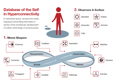
MEMETIC CARTOGRAPHY


"Memetic Cartography" - concept mapping as evolutionary strategy; developed from the ideas of Charles Darwin and Richard Dawkins; a meme--like a gene--is an idea, belief, or pattern of behavior that is "hosted" on one or more individual minds which can then reproduce itself from mind to mind.

Conceptual framework for online identity roles by Venessa Miemis that shows how individuals interact with information online. She breaks the roles down into idea shapers, observers and scribes. This is a great example of how design is an important skill for information age data processing. Human brains are slowly having to adjust to interpreting data like never before: infinite quantity, organization, and synthesis. Welcome to the future.

p.s. check out those icons... so simple, clean, and direct!

8.05.2010

INTERNATIONAL INFORMATION

Information design example

Simplicity of digital design for the tram cars in Amsterdam. Just the bare essentials. In equal weight for visual unity.