Better late than never. Axing Arial is
always a good idea. One day it will join BrushScript, Mistral, and Papyrus in the heavens.
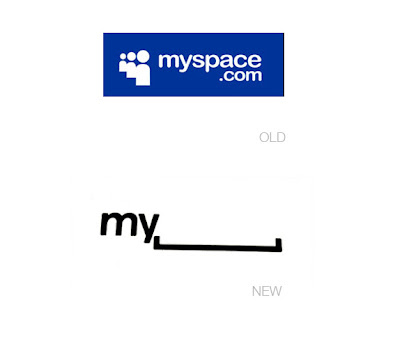
The new MySpace logo is a success and failure. What do we see here? No color. Two letters and a horizontal bracket (in balanced alignment). No .com. No icons. Just a visual pun.
The clarity and simplicity is surprising to see in light of the cluttered and complicated design of their current web site (which will also be redesigned by the end of the year). Eliminating the clutter and tightening up the interface was probably high up on the design brief. As was differentiating itself from Facebook, which also uses a blue color palette. Check and check. There is also an interactive element that has the potential to be amusing. (Screen shots
here.) The interactivity seems to be akin to some of the Google Doodles.
Let's consider a bigger question. What does this new logo stand for and how does it affect the MySpace brand identity? Over the past several years MySpace has been sinking as Facebook innovated and implemented design thinking. But we're getting to a point where the social networks can diverge. Facebook is an expanded rolodex that enables people to communicate and learn about their contacts' lives. It started by being restrictive to college students with .edu email addresses and still remains a "closed" network. MySpace began as an "open" network—a wild west of sorts. Anything went: fake profiles, spam, porn, bad html. You could search for and "friend" (verb) anyone. But it got too big and unwieldy. The layout of the web site became cluttered and confusing with very intrusive banner ads. MySpace turned to garbage. But then they ramped up efforts in the music artists section, which gave up-and-coming musicians a platform to showcase their work. Now that's different. MySpace can survive by realizing what it isn't (Facebook) and working what it is... a way for people to discover new media: musicians, comedians, and filmmakers. These are people you do not have to personally know in order to connect with interactively.
Returning to the logo design, it seems more like an advertising and promotional tool than a brand identity. For example, the MySpace business card with the logo enables employees to draw in their own personal doodles for customization. The brand identity conveyed by the logo, however, speaks to the vast openness and "anything goes" attitude that makes MySpace stand for any thing. Such a position is too broad and generic. Its home page looks like Yahoo! or any other token entertainment web portal. Not having a color palette fits with their [insert here] brand positioning, but at the same time it sacrifices distinction.
The simplicity of logo design is a big step forward, though, and MySpace is coming into an identity independent of an interpersonal social network model like that of Facebook.