A great film deserves a great promotion. Even in 1964.
Alfred Hitchcock's
Marnie is a complex psychological drama about a beautiful compulsive liar and thief (Tippi Hedren) who helps herself to her various employers' safes and vaults before changing her address and identity. One of her bosses (Sean Connery) falls for her and uncovers the truth behind her actions, but takes her as his wife rather than sending her to jail as he gets at the root psychological trauma. It has been said that
Marnie is like a culmination of
Notorious (1946),
Rebecca (1940), and
Spellbound (1945). Its cinematic triumph is the use of framing and its exquisite color palette.
The film was introduced to audiences with a bang in July of 1964. In the lead up to the release, there was a contest with the theme of "Who is the Prettiest Secretary," which surely grabbed female audiences. Then at the actual opening night select movie theaters displayed a large safe that was filled with merchandise from neighborhood retailers (jewelry, clothing, gift certificates, etc.). Moviegoers were invited to take their shot at cracking the safe, for if they succeeded the contents would be theirs.
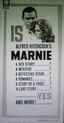
An assortment of movie posters were created billing it as Alfred Hitchcock's "Suspenseful Sex Mystery" with headlines like the below. In the image above, the list begins and ends with the most powerful selling points: sex and love. Additionally, the borders are designed in a modern 1960s style, which again sells it to a younger, more culturally immersed audience that doesn't want their mother's same old romantic movie.
Selection of poster headlines:
"On Marnie's wedding night he discovered every secret about her... except one!"= Allowing the viewer's mind to wander to interesting places to figure it out, creating expectations they want to know will or will not be met in the actual film
"Thief...Liar...Cheat...she was all of these...and he knew it!"= Painting a character will ill traits and adding second level of intrigue with a "he"
"Only Alfred Hitchcock could have created a woman —so mysterious —so fascinating —so dangerous as Marnie"= Banking on Hitchcock's directorial star power as well as setting up intrigue for a character
"Alfred Hitchcock's love stories start where others fail to go!"
= Banking of Hitchcock's directorial star power and asserting success via the negative "fail"


 These two men have something in common besides a big bottle of peroxide: Christianity. Or, perhaps more correctly, religion as a means of maintaining power and a position in the far right wing. Bill Keller (left) is a salesman turned insider trader turned jailbird turned television evangelist. And Geert Wilders (right) is a Dutch Freedom and Democracy party politician turned Group Wilders politician turned "Freedom" party politician. Both men fuel their existence by attacking Islam and advocating for things like banning the Qur'an and taxing Burqua-clad women while they peddle the Islam-as-religion-of-hate-and-death bigotry.
