7.31.2009

GE LIGHT BULBS


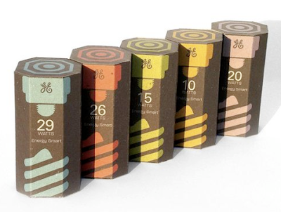
If GE re-packaged their light bulbs to look like this spec design, I doubt anyone would buy their competitor's light bulbs.

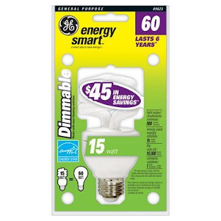
Student Kevin Kwok of Art Center College of Design recognized the hypocrisy in GE's energy-smart line of light bulbs. The packaging itself is not so energy-smart. Add to that GE's current unkempt, busy design (see below) and you have a product ripe for a re-do. Kwok deftly utilizes post-consumer cardboard that can be mailed back to GE with a used bulb for recycling. He also makes sure to design it in such a way that removes all superfluous elements to keep just the bare minimum of necessary information. Even the GE logo is knocked out so that another colour does not have to be introduced.

The design itself is very elegant and on-brand, however it does tread on uncharted territory for light bulb packaging. Since light bulbs provide light, it has been a longstanding practice to make packaging bright white or yellow to convey the benefit of the product. Well, here in 2009 we all know that light bulbs provide light and it is anachronistic to adhere to this dated practice. Kwok's design shakes this up, so at first his packaging conjures up images of candy, candles or some kind of food. This is due to the bright colours and the consumer expectation that such good-looking packaging is reserved for food/beverage products. It is refreshing to finally get over the standard white/yellow/green packaging for light bulbs.

Once you get over that ingrained expectation, it becomes easier to like this design and its use of dark brown. This shade of chestnut brown is at once rich and natural. The five colours -- each referring to a specific wattage -- are all in muted tones that complement the brown very well and chromatically refer to the faded look that natural dyes and printed materials have. The only criticism is that the need to colour code wattages might be overkill, but if they are all presented together on a store shelf the product looks beautiful and will certainly outshine its competitors.

(Below: GE's current packaging for a dimmable energy smart bulb)
FRIDAY CAT BLOGGING

7.25.2009

INNOVATE

7.24.2009

FRIDAY CAT BLOGGING

7.23.2009

CALL THE MOVING COMPANY

Tattoo House by Maynard Architects. Located in Australia. 2007.

Look past the incredible red, cream, silver and white colour palette. Look past the lines and rectangular, proportionate forms that put Mondrian to shame. And look at two things: the staircase that runs up through the kitchen and the supergraphic light projection of moving trees and other natural forms derived from the local park. Deliver those boxes now!

PUPPY MILL AD

Copy: "Psst... the secret that pet stores don't want to you know" "Meet Ernie." "Meet Ernie's Mom."

A shockingly good ad for In Defense of Animals from the bulletin board of a bookstore in Soho. Puppy mills are horrible places and many consumers have no idea that they exist and that most of the puppies in pet stores come from such mills. The body copy is a harrowing exposé by a former puppy mill investigator:
...images of female dogs dead or dying, their hair matted with excrement, their eyes ulcerated...breeding them to exhaustion...taken to auction, sold to labs, or simply shot...
Who cares if the layout was done in PowerPoint. It's killer.

KINDLE KILLER


The rumored Apple "media pad" device with a 10" touchscreen. It has been reported that Verizon is involved.

7.22.2009

KEEPING TERRORISTS OUT WITH STYLE


Credit Suisse is not afraid of good design for their security pillars.

7.20.2009

ON/OFF SYMBOLS


Why is there a vertical line inside of a broken circle? Or just a line or a circle? Does it really make sense to have a "|" and an "O"?

Turns out the "|" is really meant to be the number one and the "O" is the number zero. This is based on a binary system where the numbers all fall between 1 and 0 meaning that 1 is representative of power and 0 is representative of no -- or zero -- power. Makes sense? Well, some people assume that the "|" refers to an open circuit and "O" to a closed circuit; the latter because the ends are connected together and the former because the circuit is open at both ends.

In the image above the top left and bottom right photos are from personal computers and despite being a mac and PC, respectively, they share the same symbol. It makes sense to have the on and off symbols together since the button is dual-purpose. Yet it feels as though in order to have the symbols have equal weight, they should be overlapped and centered so that the
"|" is vertically bisects the "O". But good design prevailed! It doesn't make total sense, but it looks more dynamic since it is not as flat as a centered vertically bisected symbol. Any electrician will tell you that the top left image's symbol is actually representative of on and not fully off; the symbol for true on/off would be a vertical line inside of, but not touching, the closed circle. Check out the VCR button's symbols. It is translated as "not fully on/off" and "on", which makes sense in that the clock of the VCR is on even when the VCR itself it off. It does look awfully cumbersome. At least the powersupply (top right) gets it right.

7.19.2009

DEEP THOUGHT

Sign on traffic light pole. Chelsea neighborhood, New York. 2009.

Symbols are too complex.

7.13.2009

BREYERS ICE CREAM

I scream, you scream for a package redesign. This is a great time for ice cream package design make-overs. It is summer and the economy has gone to hell, which means that consumers are turning to quick comforts: vodka, mac and cheese and ice cream.

Breyers' redesign reflects a modern aesthetic that sheds superfluous graphic elements and embellishments. For instance, the "Real Ice Cream" line has been dropped. The trend now is not to emphasize real versus fake as it had been in the 1970s and 1980s, but rather to draw attention to the natural or organic quality of food. (I predict the next movement will be "Locally Natural".)

The shot of the ice cream is the same in terms of shape, but there is now attention to the texture of the ice cream. It was a smart idea to let the product shot dominate about 60% of the label; it also provides balance against the logo and flavour name. Again underscoring the natural is the removal of the fake spearmint leaf in lieu of a real one in the proper shade of green. Much of the mature look of the new design is derived from this overall simplification. Instead of there being two shades of green, red, and the colour of the flavour bar there is now just white and green along with the flavour colour. It's clean and appealing.

7.08.2009

JON CORZINE THE STATUE


While NJ Gov. Jon Corzine would beat his opponent Chris Christie if visual identity alone acted as the determinant, Corzine's banner ad has a problem: Corzine looks like a statue.

A statue conveys: old, stodgy, closed-minded, stolid, unchanging and of the past. Such characteristics are not desirable for a running candidate right now. Also, the posterization of Corzine's face is a knock-off of the Obama HOPE poster. On the other hand, the colour palette of light gray against that shade of blue with white is rather nice and coherent. It's obvious that the campaign strategists are trying to make a strong connection between the lauded President Obama and Governor Corzine, however I do wish they had went with an illustrated version of Corzine's face with less levels and thus with a flat vectorized appearance. Alternatively, another colour could have been used sparingly in combination with the gray to combat the statue-like appearance.

7.07.2009

PALIN: SCREW THE 48

So... Alaska feels left out and needs to be moved down to the mainland to feel like part of America? Or perhaps Alaska would like to eradicate the Midwest and insert itself into the country that it is a part of already. Aggressive move there, Barracuda.

7.06.2009

DOG CASTING SIMPLIFIED

BLUE AND ORANGE

Deplorable.