12.19.2009

LITTLE HIPPIES

It is always nice to see classic toys evolve to stay relevant with consumers. Dollhouses are no longer standard playroom toys in an age where the computer itself is one big dollhouse. Many parents begrudgingly let their kids play games online, however there is still the nostalgia of physical play that is delightfully brought to fruition with this fun Eco House. It features a rain barrel, a windmill, solar panels and of course recycling bins. Go hippies!

Such a product brings up the question of why we like to represent our lives and our families for our children to experience through play. Perhaps it is a way for adults to visually educate young children on the structure of life to give them a sense of security. Although the idea that everything is contained in one neat house is only going to set up those kids up for disappointment. As much as we want everything to fit into a box, it is not feasible since life is messy. Providing an idealized foundation, however, sets the standard from which we will deviate as adults. Regardless, we can still hope that this house imprints on the minds of our kiddies the normalcy of alternative energy and responsible consumption. (Or it's just another secret plot for the dirty hippies to take over the world.)

12.16.2009

CAUGHT RED HANDED!


Holy hell. MoMA's restaurant, The Modern, using the "typeface" Brush Script! Brush Script!

12.09.2009

NEW NY TIMES SKIM: NO MORE SKIMMING


Top: Old; Bottom: New

Really, New York Times, really? I can't believe it. The old article skimmer was a gorgeous Swiss-like grid of impossibly clear and satisfying order. The number of elements was kept at a strict minimum: sidebar, boxes, title bar, simple arrows. The new and supposedly improved skimmer brings in so much clutter and levels the elements so that they are so visually similar that the eye glazes over the entire page as one rather than quickly skimming from box to box like the old one. The New York Times is such a respected news source so it is a shame that this new design actually prevents the very thing it is intended to do: skim. Pardon the brusque criticism, but this re-design was a mistake and I intend to prove why.

One of the biggest follies in the redesign is the elimination of the hairlines that gridded out the page. This element made it very easy to make the jump from box to box while skimming. It also reinforced the equality of the text in the boxes. I can't begin to stress enough how important this detail is to the use of the site.

The colour palette has also been revamped. For some reason the new skimmer nixed the dark blue in favour of grays. The design director most likely reasoned this backpedaling by calling the new design "simpler," more "pure," and "in line with the visual identity of the black-and-white printed newspaper." Right. Okay. But leveling out the whole page in grays causes the eye to dance back and forth all over the place looking for a point to fix the gaze; in the old version the blue news headlines helped anchor the eye to streamline the optical process of actual skimming since it was the only colour on the page. The blue headlines were a useful part of the site, as that is exactly what users are looking to read and then decide to click from there.

The section sidebar jumped over to the right side of the page and so must realign itself every time you stretch the window to make it larger since more boxes come into the grid as the window becomes larger. Assuming one does not enlarge the window, the sidebar was an essential part of the quick skim since it enabled users to select their topic right away and then read the stories in a top-down mental process. The right-hand side bar forces users to first read or get distracted by the headlines on the page. In the same vein, the top bar became white (see "simple," "pure," et al above) so that it, too, becomes a part of the skimming content so as to sidetrack the eye.

Even the arrows were not spared. The old skimmer contained just the essentials: the page number and left/right arrows. First of all, why make them into buttons? We know to click on the arrows to go on to the next page. Additionally, we know what a left arrow looks like and what a right arrow looks like. Why, then, must they build in even more clutter by writing out "previous" and "next" -- they introduced 8 characters instead of 1 for the former. This is unneccessary and undermines the whole idea of skimming.

The ads. Okay, so apparently clicking the story to lead into the full article with all of its ads and banners isn't enough. The New York Times wanted another ad unit to sell. Of course it breaks up the flow of the skimmer and by doing so, it prevents the eye from skimming by acting as a visual blockade or stopping point. If they really, really needed to keep the unit, the addition of those hairlines would have helped keep it contained to look less intrusive. And of course there is the problem of content-delivering web sites not realizing how valuable online advertising is these days. The cost per unit should be much higher. It is no longer 2001 -- advertisers are no longer skeptical about putting ads on the wild west internets.

And last but not least, why do they have so many typefaces going on? The beauty of the old skimmer was that the headlines were of equal weight except for the lead story, which was given two boxes' worth of width and a larger type size. Since it was in the same typeface as the rest of the headlines, it stayed in the streamline of headlines while still standing out. The new version italicizes that lead headline, which makes the eye get stuck on it briefly because it stands out too much.

I will be very interested to see the percentage by which the number of visitors drops. If you would like to encourage the New York Times to revert back to the old design, please send feedback through this form or email Martin Nisenholtz, the SVP of Digital Operations at digitalsvp@nytimes.com.

11.30.2009

BLUE AND ORANGE


They obviously forgot how big the colour wheel is.

11.11.2009

AN ALTERNATE EMPLOYMENT OPTION

Source: Facebook.com

A not-so-bad take on the excessive use of recession-speak in advertising. Humor is a great way of reaching people and pairing that humor with the usually serious and somber economic relevance communication breaks through in a charming sort of way.

11.09.2009

DEEP THOUGHT

11.06.2009

FRIDAY CAT BLOGGING

10.29.2009

HTC

Bad brand name. Good tv spot. It is a good example of how the choice of soundtrack matters so much in making or breaking commercials. Try watching this on mute with a different song in the background. It could have a cheesy tone by being set to "Chain Reaction" by Carly Commando like this American Express OPEN tv spot. But it doesn't. This HTC spot has the tone of fast, dramatic, intense, sure, and moving thanks to "Sinnerman" by Nina Simone.

NOT A FLOP

Fitflop print ad. Subway train. 2009.

This ad has a good tagline: "Get a workout while you walk."

It is a pretty compelling print piece. The model in the photo is very thin and is posed in such a way that thins and elongates her legs. Even the diagonal of her blue shirt over the skirt brings the eye upward. Also, we're not distracted by a pretty face since the photo is cut off at the model's neck. The shoe has a unique textured fabric that at once looks rich and lengthens the model's leg because of the backless mule style. The choice of location -- a supermarket -- is a great one because it's a place where everyone goes almost every day and works with the casual style shoe. The headline is as good as the tagline because of its truth and appeal to our inner desire for an easy-as-possible work-out.

10.24.2009

A REGULAR CHOICE


These are one of the most stunning heels this fall: Irregular Choice's "Flick Flack". The addition of two tone fabric on the front of the shoes (black with white polka dots and black and white stripes) makes this shoe very unique not to mention very flattering by using the diagonal line of the flap and the vertical stripes to elongate the leg.

The exterior is black patent, which trots happily on rainy days and also catches the eye. It is very natural for humans to be attracted to shiny things. This could be explained by a variety of reasons including the notion that patent reflects light, which man has been attracted to for basic survival (water, the sun) throughout time. A more narcissistic approach is that we like to see our own reflections. More likely, however, is that we want something new, untarnished and clean; shine accentuates these qualities.

10.23.2009

FRIDAY CAT BLOGGING

10.18.2009

ARTICLE SKIMMER

These days most of us get our news online. As such, it's important for news web sites to be very user friendly and a pleasure to read. Yet so many news sites rely on the same column layout styles. The New York Times, however, gives us news how we actually read news: by skimming. Each bit of information is in the same size box (except the one feature story, which is two boxes), so that our eyes are able to skim easily because each article is of equal weight. This definitely satisfies the OCD-style order we all secretly crave.

10.15.2009

SEXY SPORTY STUBBY

BMW Z4 Top: new body; Bottom: old body

The problem with the old BMW Z4 body is that it is what every man does not want to be: stubby. It looks like the long front hood was lifted from the 3 or 5 series and stuck onto a sports car. Visually, it is unbalanced and disproportionate. This is largely because the length from the front grill to the door hinge is nearly the same length as the second half of the car from the door hinge to the tail light. Finally, female designers* gave the new body -- that started with the 2009 model -- harmony and balance by optically correcting the "stubby" effect. This was corrected in mostly two simple strokes: 1) the hood does not dip in where it meets the windshield, but rather the line continues and visually connects with the line of the top of the trunk in a unified degree of curvature. That subtle dip found in the earlier models is very slight, but makes a big difference. 2) The trunk seems chopped off at the end, which makes the car feel too short and thus makes the front half front-heavy. Adding to that is the window that sensually curves around to the right to parallel the shape of the hard top and continue the curve of the body whereas the old model's window is cut off, like the trunk, with a hard vertical line. For years men have been driving around in a short and stubby sports car, and it is actually quite funny that it took a team of women to help make this man's midlife crisis vehicle more ferociously masculine.

* Exterior by Juliane Blasi and interior by Nadya Arnaout

10.14.2009

ATTRACTION REPULSION

Road Kill Carpet. Wool, 65x94"

So you want something to soften your step on your wood floors. Something that adds to your decor. Something that is a bear skin rug, but won't get the PETA people to attack you. Something like this... OOOMS' roadkill rug.

Perhaps the appeal of this rug stems from that feeling we all get as we drive by a slaughtered fox or bunny on the road. We are interested in looking at the dead thing, which is radically different and removed from the image of an animal we're used to seeing as cute and alive. Emotionally, we're sad. Yet we also feel guilty for staring at the grotesque animal. The rug allows us to satisfy that desire to look, yet softens our gaze as it reminds us of cartoons. Dead and scary. Yet cute and cuddly. There is a realistic colour palette of smoke gray (the road) with a touch of red and brown. The placement of the roadkill on the corner functions to make the kill seem real -- it is life-size -- without overwhelming the rug itself. Also, the width of the kill is just about half the width of the rug and one-third of the length, which gives the eye a pleasing balance.

10.09.2009

HOW TO FIX MAGAZINES: CENTRALIZE AND SIMPLIFY


Magazines and newspapers are continuing to lament their dwindling circulations and inevitable deaths. Their web sites may or may not charge for content. They are losing money. It's a problem. Want to know how to fix it?

Part of the problem with media today is that it is incredibly disorganized and all over the place. Many people have subscriptions to an assortment of media such as: The Wall Street Journal online, Financial Times newspaper, The Economist magazine, on-demand pay-per-view movies, etc. The problem is that a consumer must go directly to each medium they want access to and pay for each separately. In other words, it is not easy for consumers to consume media. If there was one central place in which one could subscribe to everything all at once, perhaps consumers would subscribe to more media. That is why I propose centralizing all media subscriptions in one spot to make things fast and easy for consumers who largely have no time to leisurely shop for and subscribe to magazines, online access, newspapers, movies, internet, tv, etc. Since cable tv/internet providers are ubiquitous in being common to almost all households, the easiest thing would be to throw subscriptions onto the provider's bill. Not only does it make it easy for consumers, but it also keeps tabs on which subscriptions are due to expire and when. In fact, Time Warner already has online bill pay so adding this would not be a monumental endeavor.

Media could be sorted by category for consumers to simply check boxes:

Cable TV
☒ All Channel plan

☐ 100 Channels plus HBO, Showtime


Internet
Earthlink high-speed
Roadrunner high-speed

Telephone (landline and/or wireless)
Unlimited calling plan
Wireless plan

Magazines
Wallpaper
Dwell
The Economist
The Week
...etc.

Magazines Online
dwell.com
economist.com
cosmopolitan.com
theweek.com
...etc.

Newspapers
The New York Times
The Wall Street Journal
Le Figaro
...etc.

Newspapers Online
www.wsj.com
www.nytimes.com
...etc.

10.02.2009

LET'S GO TO THE LOO


Forget fancy nameplates. Office restroom signs deserve creative design.

9.29.2009

WANTED: GOOD DESIGN


Dear Switzerland,

Please help.

Sincerely,
New York

9.27.2009

VINYL VINO


The brilliance of this vinyl sticker is the pleasing way in which a real object that you already own becomes the star of the art work. Kind of makes Duchamp a lot less exciting.

9.25.2009

ABSOLUT WORLD

Absolut wild posting. Houston Street, New York.

While the simplicity and unity of the colour palette and typography make for a beautiful poster, I really don't care about some absolut fantasy world I know nothing about that is the basis of this campaign. I am in this world and I will live, die and drink my vodka here.

9.23.2009

EVEN HITLER HATES COMIC SANS


Arial? Mistral? Papyrus? Schweine!

Watch it here

GUERNICA

Picasso, Pablo. Guernica. 1937. Oil on canvas. 25' 6" x 11' 5"

In 1884 a serious earthquake struck Malaga. A three year old was whisked through the town, his eyes wide in awe and horror at the contorted and screaming faces, bodies lying in the street, and collapsed horses and other farm animals left half-dead. This highly observant child plunged deep into the chaos and looked on at the scene around him, confused and disoriented, but curious. The boy's mother, writhing and screaming in pain amidst the destruction and turmoil, gave birth to his sister that very night before him.

9.18.2009

FRIDAY CAT BLOGGING

9.12.2009

OBJECTS OF CO-DEPENDENCY

Just Between You and Me

Just Keeping an Eye on You


From a series by Keetra Dean Dixon. Let the imagination fill in the blanks.

9.07.2009

GLORIOUS INGLOURIOUS BASTERDS


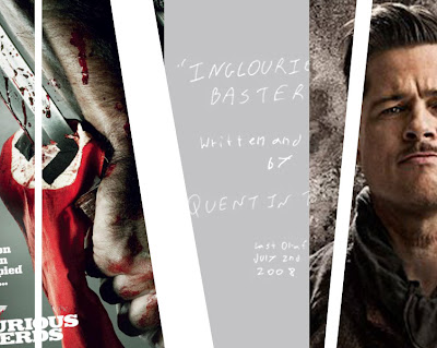
Don't call it a movie. This is a film.

Much of the brilliance of this film arises from the ways in which writer and director Quentin Tarantino playfully toys with what audiences and film theorists expect in a genre film. Inglourious Basterds is technically a contemporary western, however Tarantino sets out to either break or modify all of the traditional codes inherent in the genre. Check it out:

Code: Good guy wears a white hat
Modified Code: Good guy wears a white tuxedo

Code: Takes place in the American West
Modified Code: Features lead character from American West
Modified Code: Opening scene is in the country that visually resembles the American Great Plains

Code: There's a saloon or bar where both hero and villain drink hard liquor
Modified Code: The villain drinks a glass of milk

Code: There's a big shoot out at the end
Modified Code: The film is one big shoot out -- Pvt. Fredrick Zoller's film, which carries the plot along, is entirely a shoot out

We're all used to the same formula wrapped up in a happy little package: the set-up, the conflict, the tease of a resolution, and finally the resolution. Tarantino distorts multiple macro and micro aspects of the film so that it first violates our schema for genre; and then he distorts the narrative by breaking the rules of history in a pleasantly unexpected way. Cinematically, his attention to detail through words and mise-en-scene imprints certain images and moments in our minds. The result is a real auteur film right up there with Truffaut, Renoir and Hitchcock that derives its strength from the director also being at the helm of the screenplay.

The Characters
They're incredibly well-developed. Many of the characters get their own songs as they are introduced in the film and they each have such individual quirks that they become complex and memorable. For example, "White Lightning" by Charles Bernstein for Lt. Aldo; "Slaughter" by Billy Preston for Stiglitz; and "The Surrender" by Ennio Morricone for Sgt. Donowitz. Another detail that gets images and scenes to stick in viewers' minds is the use of a memorable nick-name. Inglourious Basterds is loaded with good ones: "The Bear Jew" and "The Jew Hunter". Even the characters' actual names are deliberately one of a kind: Shosanna, Aldo, Landa, von Hammersmark, Zoller, Wilhelm Wicki.

The Soundtrack
Just because we're in WWII doesn't mean we have to listen to the same old WWII swing music. Tarantino pops out of the period by including non-diegetic music like a song by David Bowie. And really, why the hell should we absolutely have to transport our mindsets to the 1940s when we're viewing right now in the 2000s? As mentioned above, to give his characters more depth and weight Tarantino bestows some with an entrance theme song, each being appropriate not only in terms of title and lyrics, but actual mood and feel of the song. The use of music simply for relevant lyrics is the mark of a true simpleton director.

Language
Throughout the film Tarantino outwardly plays with the roles of viewer and director so that our existing expectations of language are jostled. In the first scene in which Col. Landa is introduced the exchange is, as expected, in French with English subtitles. But then Landa, the character, says to LaPadite for us, the audience, let's use English; they then resume their conversation in English. It seems to be a snide way of poking fun at the absurdity of other films that use dialogue in other languages just to remain historically and culturally accurate. A film is a creative work of art that doesn't necessarily have to be so accurate. Tarantino comes back to again mock language used for language's sake during the tavern scene in which the Basterds have a meeting with von Hammersmark. Lt. Hicox' German accent is "off" according to one of the enemy SS soldiers, which then sets off one of Tarantino's trademark Mexican stand-off scenes. There is one more stab at language during the climax of the movie premiere. This time Tarantino brings to light the embarrassing truth that Americans only know English and are stupidly limited when a second language is needed.

Let's not forget the title of the film and its intentional misspelling. "Basterds" could refer to the uneducated George Bush-style American stupidity that Aldo represents. "Inglourious" could have simply been misspelled simply to match "Basterds" or it could be, like many of Tarantino's other touches, a way of distinguishing the film as one of a kind to stand out amongst war movies (especially 1977's The Inglorious Bastards). The idea of labeling this renegade group as honorless when they doing what Americans should have done during Hitler's reign seems nonsensical. It was the American public and the government present during WWII that were the actual inglorious ones, as they were too high up on a morality horse to assasinate an evil dictator. Or too inept to do so (but I don't buy that).

The Shot
Auteur directors usually scrutinize every single shot so that frames are staged in artful ways independent of the film's story or plot. The opening scene of Inglourious contains frames that are very unbalanced with many vertical lines striking through the filmic landscape; the way in which the axe is left slicing into the trunk of a tree is at once malicious and violent. The shot of the axe foreshadows not only the violence that is about to come, but it also conveys a feeling of anger that comes to set the backbone of the entire vengeful narrative.

Notice anything especially visually compelling in the opening scene? The colour palette and presence of props and landscape is kept to a minimum for a clean and striking impact. The shots are not cluttered with stuff so that select props stand out very markedly: the axe, the glass of white milk. Many of the scenes are clean by sticking with one predominant colour or similar blend of colours such as the luscious, saturated reds of the movie premiere theater scene: the red Nazi flags sumptuously draped all over Shosanna's theater, the red of Shosanna's plump lips, and the fluttering sensuality of Shosanna's elegant red dress. These deep reds are also function collectively to foreshadow the blood bath that is to come. By exploiting the richness of colour Tarantino gives a level of depth to the film so that it stains our collective consciousness.

Narrative
Finally. A WWII movie in which Hitler actually gets killed. It's about time. For so many years audiences have gotten so accustomed to WWII movies that stay so true to history that it is expected that Hitler lives, at least until his own suicide. Tarantino exploits our deep desire for the evil one to be toppled so that the resolution of the film is intensely satisfying. After all, it is a western.

9.01.2009

HOW DO YOU GET YOUR NEWS?


8.29.2009

EYES NEVER CHANGE


An immutable endearing quality: eyes that you could stand to gaze into forever. Wrinkles, sagging and paunch come with age. Eyes never change.

8.26.2009

DEEP THOUGHT

8.23.2009

BLUE AND ORANGE

Grotesque.

8.19.2009

CALL THE MOVING COMPANY

Richmond Place. Boyd Cody Architects. Dublin, Ireland. 2005.

This brick residence in Dublin is a 2-bedroom and 2-bathroom in the style I like to call Mortem Bauhaus. While the house is remarkable inside and out from a design standpoint, it is just that: a house and not a home. The interior is very hard and cold in pure, pared down colours with the clean, hard lines Bauhausians adore. In addition to feeling frigid, the interior is very unwelcoming -- the antithesis of what we associate with charming Irish culture -- with isolated and sectioned off spaces, which render it more mausoleum than residence.

Richmond Place seems to be a rebellion against the prejudicial, ingrained images the world has of Ireland. A contemporary stand of new against old. A challenge to the prevalent traditional style that has become so ingrained and thoughtless that creativity and innovation have been lost. With a deliberate hard shell to protect itself from the frightening softness and overwhelming emotion of conventional Irish culture. This is readily apparent in the way the sharp corner of the house juts out aggressively into the street. The design is different, yes, but to such an extreme that the house becomes an inhospitable place.

Richmond Place does not invite you in with warmth, a hearth and detailed finishes. The upper left photo shows us the living room and its modest fireplace that is cut into the lower corner of a wall; it is an accessory to the space and not, as is frequently seen, the focal point of the living space. To the upper left of the fireplace is a narrow window that leads to the kitchen. The kitchen, which again is normally another focal point of a home, is removed from the living space. Well, why not. Rigor mortis does not require a full and satiated belly. Even the upper level of the house shows us a ceiling support system that is eerily similar to the hollow rib cage of a whale carcass left to decay on a beach. This design may appeal to some, perhaps those who themselves are cold and hardened. Or perhaps those who desire to bring warmth and touch that will help turn this house into a home.

8.14.2009

FRIDAY CAT BLOGGING

8.09.2009

BRINKS BECOMES BROADVIEW


Brinks Home Security has changed their name to Broadview Security. It was because in deciding to spin off the home security unit, part of the contract stipulated that they had to change their name otherwise hefty royalty fees would have to be paid to Brinks.

The decision to change the name and re-do the brand identity came at a good time. It is relatively smart to get consumers to process the name change before the housing market turns around and people are more likely to purchase alarm systems for their homes. Although if a product is good and is marketed well then it should not matter, but why not take advantage of the state of our markets right now. Why not? Because in hustling a new visual identity out the door, brand equity was sacrificed.

Consumers have the images of armored trucks and hefty armed men in their minds when they think of "Brinks." As such, it is great for a home security system to piggyback on that association. It creates the feeling of intense security for your home when applied to Brinks Home Security, albeit many consumers just think of "Brinks" and drop the "Home Security" from their minds when they think of this company. This is great. For this company to intentionally dissolve that great connection and go with a name like "Broadview Security" is just a shame. Even if you had to pay royalties, to ditch the Brinks name you better spend a lot of time developing an even better name that doesn't rely on piggybacking on such a strong brand. Broadview just isn't it.

Okay, I get it. The view is broad. They see everything. They know what is happening in your home and can respond appropriately. They are omniscient. Alright, that is applicable. But the name itself is broad. Broadview Optics. Broadview Networks. Broadview Nursing. The meaning of "seeing all" is too broad to be uniquely applicable to home security. And I actually would like my security company to have a narrow view; that is, a view focused in on my home rather than a big, broad view that looks at everything.

The use of Gotham is also broad since that typeface is used heavily in the design world, especially now after President Obama's acclaimed use of it. Gotham is a great typeface; Hoefler & Frere-Jones knows what they're doing. I'm just saying they could have searched deeper for a better fit that is not so prevalent and unassuming. The kerning is tight on this logo, which is good, but the leading between Broadview and Security is too spacious and distances the two words. The typography, however, is the least of this logo's problems. In accordance with the broad idea that the company "sees all" we have two parentheses encapsulating "view" to symbolize the eye. The designer could at least have experimented a lot more with creating shapes rather than simply rotating a parenthesis ninety degrees.

8.07.2009

BECOME A CARTOON

What is so appealing about turning yourself into a cartoon? Or rather, turning your photo into a cartoon.

What would compel someone to click through on this advertisement? It's not as simple as wanting to have an image of yourself in a different and vectorized form. The desire to do this stems from one's interest in one's image. There is no investment in the self here since you are taking something that is already an image of you -- your photo -- and getting another image of you. It's ultimately a representation of you that you want others to see. Cartoon-izing yourself also has another function: to confirm an attractive image. You're not going to submit an unflattering photo for this service; you're going to submit a photo that you believe is attractive. Then when you get back an image of a big-eyed, well-proportioned, perfect-haired cartoon, you will smile and like yourself more because of an image. This ad is contributing to the societal problem of people having a preoccupation with images of their selves rather than just being themselves. Don't click through.

8.06.2009

HIGH SCHOOL ART


Look past the ridiculous photo of me as a junior in high school: there is a Matisse and a Rockwell behind me. Advanced art students in this particular high school had the opportunity to reproduce famous works of art on the walls of the school. While it is important that students get to create art from their own visions, it is essential to also learn about great works and artists. Plus, non-art students get exposure to art they could otherwise go their whole lives without seeing. It's really great that this high school recognized the importance of art in a school's curriculum and that the presence of art should be felt throughout the entire school. Not to mention it makes for a very nice-looking hallway.

7.31.2009

GE LIGHT BULBS


If GE re-packaged their light bulbs to look like this spec design, I doubt anyone would buy their competitor's light bulbs.

Student Kevin Kwok of Art Center College of Design recognized the hypocrisy in GE's energy-smart line of light bulbs. The packaging itself is not so energy-smart. Add to that GE's current unkempt, busy design (see below) and you have a product ripe for a re-do. Kwok deftly utilizes post-consumer cardboard that can be mailed back to GE with a used bulb for recycling. He also makes sure to design it in such a way that removes all superfluous elements to keep just the bare minimum of necessary information. Even the GE logo is knocked out so that another colour does not have to be introduced.

The design itself is very elegant and on-brand, however it does tread on uncharted territory for light bulb packaging. Since light bulbs provide light, it has been a longstanding practice to make packaging bright white or yellow to convey the benefit of the product. Well, here in 2009 we all know that light bulbs provide light and it is anachronistic to adhere to this dated practice. Kwok's design shakes this up, so at first his packaging conjures up images of candy, candles or some kind of food. This is due to the bright colours and the consumer expectation that such good-looking packaging is reserved for food/beverage products. It is refreshing to finally get over the standard white/yellow/green packaging for light bulbs.

Once you get over that ingrained expectation, it becomes easier to like this design and its use of dark brown. This shade of chestnut brown is at once rich and natural. The five colours -- each referring to a specific wattage -- are all in muted tones that complement the brown very well and chromatically refer to the faded look that natural dyes and printed materials have. The only criticism is that the need to colour code wattages might be overkill, but if they are all presented together on a store shelf the product looks beautiful and will certainly outshine its competitors.

(Below: GE's current packaging for a dimmable energy smart bulb)

FRIDAY CAT BLOGGING

7.25.2009

INNOVATE

7.24.2009

FRIDAY CAT BLOGGING

7.23.2009

CALL THE MOVING COMPANY

Tattoo House by Maynard Architects. Located in Australia. 2007.

Look past the incredible red, cream, silver and white colour palette. Look past the lines and rectangular, proportionate forms that put Mondrian to shame. And look at two things: the staircase that runs up through the kitchen and the supergraphic light projection of moving trees and other natural forms derived from the local park. Deliver those boxes now!

PUPPY MILL AD

Copy: "Psst... the secret that pet stores don't want to you know" "Meet Ernie." "Meet Ernie's Mom."

A shockingly good ad for In Defense of Animals from the bulletin board of a bookstore in Soho. Puppy mills are horrible places and many consumers have no idea that they exist and that most of the puppies in pet stores come from such mills. The body copy is a harrowing exposé by a former puppy mill investigator:
...images of female dogs dead or dying, their hair matted with excrement, their eyes ulcerated...breeding them to exhaustion...taken to auction, sold to labs, or simply shot...
Who cares if the layout was done in PowerPoint. It's killer.

KINDLE KILLER


The rumored Apple "media pad" device with a 10" touchscreen. It has been reported that Verizon is involved.

7.22.2009

KEEPING TERRORISTS OUT WITH STYLE


Credit Suisse is not afraid of good design for their security pillars.

7.20.2009

ON/OFF SYMBOLS


Why is there a vertical line inside of a broken circle? Or just a line or a circle? Does it really make sense to have a "|" and an "O"?

Turns out the "|" is really meant to be the number one and the "O" is the number zero. This is based on a binary system where the numbers all fall between 1 and 0 meaning that 1 is representative of power and 0 is representative of no -- or zero -- power. Makes sense? Well, some people assume that the "|" refers to an open circuit and "O" to a closed circuit; the latter because the ends are connected together and the former because the circuit is open at both ends.

In the image above the top left and bottom right photos are from personal computers and despite being a mac and PC, respectively, they share the same symbol. It makes sense to have the on and off symbols together since the button is dual-purpose. Yet it feels as though in order to have the symbols have equal weight, they should be overlapped and centered so that the
"|" is vertically bisects the "O". But good design prevailed! It doesn't make total sense, but it looks more dynamic since it is not as flat as a centered vertically bisected symbol. Any electrician will tell you that the top left image's symbol is actually representative of on and not fully off; the symbol for true on/off would be a vertical line inside of, but not touching, the closed circle. Check out the VCR button's symbols. It is translated as "not fully on/off" and "on", which makes sense in that the clock of the VCR is on even when the VCR itself it off. It does look awfully cumbersome. At least the powersupply (top right) gets it right.

7.19.2009

DEEP THOUGHT

Sign on traffic light pole. Chelsea neighborhood, New York. 2009.

Symbols are too complex.

7.13.2009

BREYERS ICE CREAM

I scream, you scream for a package redesign. This is a great time for ice cream package design make-overs. It is summer and the economy has gone to hell, which means that consumers are turning to quick comforts: vodka, mac and cheese and ice cream.

Breyers' redesign reflects a modern aesthetic that sheds superfluous graphic elements and embellishments. For instance, the "Real Ice Cream" line has been dropped. The trend now is not to emphasize real versus fake as it had been in the 1970s and 1980s, but rather to draw attention to the natural or organic quality of food. (I predict the next movement will be "Locally Natural".)

The shot of the ice cream is the same in terms of shape, but there is now attention to the texture of the ice cream. It was a smart idea to let the product shot dominate about 60% of the label; it also provides balance against the logo and flavour name. Again underscoring the natural is the removal of the fake spearmint leaf in lieu of a real one in the proper shade of green. Much of the mature look of the new design is derived from this overall simplification. Instead of there being two shades of green, red, and the colour of the flavour bar there is now just white and green along with the flavour colour. It's clean and appealing.

7.08.2009

JON CORZINE THE STATUE


While NJ Gov. Jon Corzine would beat his opponent Chris Christie if visual identity alone acted as the determinant, Corzine's banner ad has a problem: Corzine looks like a statue.

A statue conveys: old, stodgy, closed-minded, stolid, unchanging and of the past. Such characteristics are not desirable for a running candidate right now. Also, the posterization of Corzine's face is a knock-off of the Obama HOPE poster. On the other hand, the colour palette of light gray against that shade of blue with white is rather nice and coherent. It's obvious that the campaign strategists are trying to make a strong connection between the lauded President Obama and Governor Corzine, however I do wish they had went with an illustrated version of Corzine's face with less levels and thus with a flat vectorized appearance. Alternatively, another colour could have been used sparingly in combination with the gray to combat the statue-like appearance.