1.29.2010
1.26.2010
FISCHL'S CRACKS OF DISCOMFORT
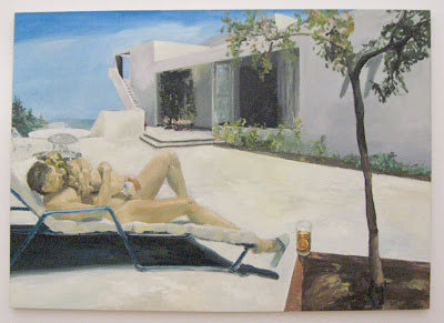
 Eric Fischl. Daddy's Girl. 1984. Oil on canvas. 198 x 78 in.
In a century from now what will be Eric Fischl's artistic oeuvre? Dali makes us startle. Matisse makes us smile. And Fischl? Fischl makes us uncomfortable.
His work is imbued with thick tension as he captures tantalizing juxtapositions by camera that would otherwise have been lost in the nanoseconds of time. Within those photos are split seconds that represent the "cracks" of the world he is witnessing that then get transposed onto canvas. More than that, however, the man himself exudes his oeuvre. Those in his physical presence are made uncomfortable by Fischl's words, body language, subtextual sexual innuendo, hidden metaphors, etc. and one is left to wonder if Fischl even realizes that he is doing it. Just as Salvador Dali was surrealist showman, Fischl is discomfort.
The painting above, Daddy's Girl, emerges from the discomfort inherent in our anxieties and problems concerning the naked body. Fischl readily accepts this confrontation as a look into what appears to be a friendly look at a summer day on high cliffs of St. Tropez. Blue sky. White-hot house. Flip-flops. Cold glass of ice tea. As relaxing as this scene seems, it is belied by the classic Fischl tension that is always found in the details. For instance, one of Fischl's last additions to the composition is a very quenching glass of ice tea that may teeter off the ledge at the slightest touch of wind. This glass is placed between the characters and the viewer, thereby connecting the viewer's gaze intimately to the scene; it feels as though we're sitting in the painting at eye level with the drink, which is right in our reach. The glass also stands out a visual stopping point, balancing out the blue of the sky as its complementary colour. Another detail is the staircase that leads up to a rail-less balcony from which a little toddler could easily tumble. And the dangling flip-flop that is about to fall off. Clearly there is a running theme of "falling," which itself doesn't really matter; it is the "almost," the moment right before the fall, that is fun for Fischl to psychologically exploit.
As the title of the painting says, however, the subject of the painting is the people. The position of the little girl on top of her daddy is that of a very close embrace. But wait. It seems as though the girl is struggling to get off. How old is that girl? Why are these people naked? Wait, is that his... oh, nevermind. When he began this painting, Fischl asked himself, "what's wrong with flesh-on-flesh?" The image above features a man hugging a little girl. There's nothing really askew, yet we don't trust that because the two figures are alone. And in knowing that, we start to build a narrative and concede that if something was to be going on, we would not be able to stop it. Or we think that there could be something going on unconsciously between them. Suddenly the viewer of the painting is conscious of her own perverse and lewd expectations.
It's a very uncomfortable position.
1.20.2010
1.15.2010
WEATHER WONDERINGS

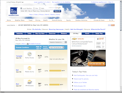
 Top: weather.com, Bottom: weatherunderground.com
Two of the main web sites that let us know if we're wearing sandals or sweaters today are Weather.com and WeatherUnderground.com. While in theory they should provide the same data, the reality is that Weather.com looks, well, really bad in comparison to the less-fancy, but gauge-driven WeatherUnderground.com.
From a brand perspective, Weather.com (The Weather Channel) seems to have the upper hand with its absolute name and the same trusted blue-square logo from the teevee heydays. But such is not the case. In the early 2000s The Weather Channel wanted to capitalize on greater ad dollars, which they thought was possible through developing original programming. Big mistake. We just wanted our weather on the :08s... a little radar... humidity... maybe even some averages and records. Alright, we'll take the talking heads. Paul Goodloe, et al. But they forgot -- or just ignored -- that viewers tuned into that channel to get the information they needed in a succinct forecast, not to see how people in Kansas chase down thunderstorms. That same fatal error has been carried over into Weather.com so that it becomes annoying difficult to get the information that we came to the web site for in the first place.
Despite the unsophisticated logo and a coincidental name relation to a terrorist group, Weather Underground has the upper hand. Now more than ever we seek out information that we want fully and immediately. Weather forecasts inherently come with oodles of numerical data that can be presented in a variety of ways. The appeal of Weather Underground is that they understand this and thus seek to give us data in a glance that has a visual likeness to the information aeronautical professionals use.
On the left hand side of the Weather Underground's local weather page there is a bordered box that calls out the important stats: temp, wind, humidity, pressure, visibility, UV index, etc. We also get a thumbnail of radar in a glance that we can choose to enlarge. If we have the time, our eyes may then sweep to the right to take in the 5-day forecast in one gulp. The colour-coding of the high and low temps and percentages of precipitation lets us take in this information even faster. There are also all sorts of other goodies that we can check out if we want to: latitude and longitude, astronomy, diverse radar views, the time, and even a WunderPhotos gallery for especially interesting weather-related photos. All of this is condensed into the default viewing space of the browser window. The difference between the two web sites is stark in the screenshots that appear above. Conclusion: Weather.com provides 5% of the information Weather Underground provides in the same amount of space.
Labels:
interactive
1.11.2010
WHO SHOT THE CUCKOO?

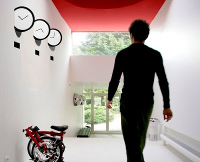
It's about time that a new type of wall clock came into existence that considers not only the design of the piece itself but also the environment in which the clock shall live. This design probably evolved from subconscious knowledge of the irrelevancy of wall clocks; we mainly use wristwatches and mobile phones to tell time these days. Enter the Insert Clock designed by Leo Yiu Chun Pong. A functional sculpture.
More clock porn: http://www.nextime.nu
Labels:
design
1.09.2010
DIE HASELNUSS

One of the smartest elements in Toffifee's package design is the use of green to complement the rich browns. Without the green the package would seem cheap because the green leaves indicate the implied use of real ingredients. The leaves also act as a garnish for the toffs just as they would chocolate mousse or souffle, which then raises Toffifee's value to consumers by reminding us of similarity to the aforementioned desserts. On the same note, the inside tray is gold so that it fits with the upscale brand. It also is a nice accent, both in colour and texture, to the brown+amber+white+green colour palette on the outside of the box. The best part? The toffs taste just as good as they look.
Labels:
package design
1.07.2010
ALL THE RAGE

This pervasive colour palette has officially jumped the shark. Architects all over the world are going through a "Red Orange+Gray" phase (e.g. contemporary homes, Brandhorst Museum interior, et al). It is no longer cutting edge to throw this bold colour onto the subdued tones of modernity. Mustard yellow anyone?
Labels:
architecture,
design
Subscribe to:
Posts (Atom)


