
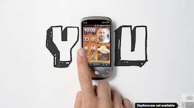
 Bad brand name. Good tv spot. It is a good example of how the choice of soundtrack matters so much in making or breaking commercials. Try watching this on mute with a different song in the background. It could have a cheesy tone by being set to "Chain Reaction" by Carly Commando like this American Express OPEN tv spot. But it doesn't. This HTC spot has the tone of fast, dramatic, intense, sure, and moving thanks to "Sinnerman" by Nina Simone.
10.29.2009
HTC
Bad brand name. Good tv spot. It is a good example of how the choice of soundtrack matters so much in making or breaking commercials. Try watching this on mute with a different song in the background. It could have a cheesy tone by being set to "Chain Reaction" by Carly Commando like this American Express OPEN tv spot. But it doesn't. This HTC spot has the tone of fast, dramatic, intense, sure, and moving thanks to "Sinnerman" by Nina Simone.
NOT A FLOP
 Fitflop print ad. Subway train. 2009.
It is a pretty compelling print piece. The model in the photo is very thin and is posed in such a way that thins and elongates her legs. Even the diagonal of her blue shirt over the skirt brings the eye upward. Also, we're not distracted by a pretty face since the photo is cut off at the model's neck. The shoe has a unique textured fabric that at once looks rich and lengthens the model's leg because of the backless mule style. The choice of location -- a supermarket -- is a great one because it's a place where everyone goes almost every day and works with the casual style shoe. The headline is as good as the tagline because of its truth and appeal to our inner desire for an easy-as-possible work-out.
10.24.2009
A REGULAR CHOICE


These are one of the most stunning heels this fall: Irregular Choice's "Flick Flack". The addition of two tone fabric on the front of the shoes (black with white polka dots and black and white stripes) makes this shoe very unique not to mention very flattering by using the diagonal line of the flap and the vertical stripes to elongate the leg.
The exterior is black patent, which trots happily on rainy days and also catches the eye. It is very natural for humans to be attracted to shiny things. This could be explained by a variety of reasons including the notion that patent reflects light, which man has been attracted to for basic survival (water, the sun) throughout time. A more narcissistic approach is that we like to see our own reflections. More likely, however, is that we want something new, untarnished and clean; shine accentuates these qualities.
10.23.2009

10.18.2009
ARTICLE SKIMMER
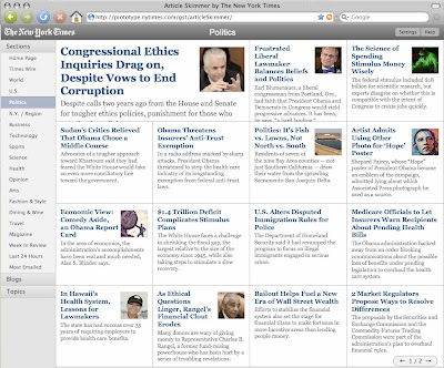 These days most of us get our news online. As such, it's important for news web sites to be very user friendly and a pleasure to read. Yet so many news sites rely on the same column layout styles. The New York Times, however, gives us news how we actually read news: by skimming. Each bit of information is in the same size box (except the one feature story, which is two boxes), so that our eyes are able to skim easily because each article is of equal weight. This definitely satisfies the OCD-style order we all secretly crave.
10.15.2009
SEXY SPORTY STUBBY
 BMW Z4 Top: new body; Bottom: old body
The problem with the old BMW Z4 body is that it is what every man does not want to be: stubby. It looks like the long front hood was lifted from the 3 or 5 series and stuck onto a sports car. Visually, it is unbalanced and disproportionate. This is largely because the length from the front grill to the door hinge is nearly the same length as the second half of the car from the door hinge to the tail light. Finally, female designers* gave the new body -- that started with the 2009 model -- harmony and balance by optically correcting the "stubby" effect. This was corrected in mostly two simple strokes: 1) the hood does not dip in where it meets the windshield, but rather the line continues and visually connects with the line of the top of the trunk in a unified degree of curvature. That subtle dip found in the earlier models is very slight, but makes a big difference. 2) The trunk seems chopped off at the end, which makes the car feel too short and thus makes the front half front-heavy. Adding to that is the window that sensually curves around to the right to parallel the shape of the hard top and continue the curve of the body whereas the old model's window is cut off, like the trunk, with a hard vertical line. For years men have been driving around in a short and stubby sports car, and it is actually quite funny that it took a team of women to help make this man's midlife crisis vehicle more ferociously masculine.
* Exterior by Juliane Blasi and interior by Nadya Arnaout
10.14.2009
ATTRACTION REPULSION
 Road Kill Carpet. Wool, 65x94"
So you want something to soften your step on your wood floors. Something that adds to your decor. Something that is a bear skin rug, but won't get the PETA people to attack you. Something like this... OOOMS' roadkill rug.
Perhaps the appeal of this rug stems from that feeling we all get as we drive by a slaughtered fox or bunny on the road. We are interested in looking at the dead thing, which is radically different and removed from the image of an animal we're used to seeing as cute and alive. Emotionally, we're sad. Yet we also feel guilty for staring at the grotesque animal. The rug allows us to satisfy that desire to look, yet softens our gaze as it reminds us of cartoons. Dead and scary. Yet cute and cuddly. There is a realistic colour palette of smoke gray (the road) with a touch of red and brown. The placement of the roadkill on the corner functions to make the kill seem real -- it is life-size -- without overwhelming the rug itself. Also, the width of the kill is just about half the width of the rug and one-third of the length, which gives the eye a pleasing balance.
10.09.2009
HOW TO FIX MAGAZINES: CENTRALIZE AND SIMPLIFY

Magazines and newspapers are continuing to lament their dwindling circulations and inevitable deaths. Their web sites may or may not charge for content. They are losing money. It's a problem. Want to know how to fix it?
Part of the problem with media today is that it is incredibly disorganized and all over the place. Many people have subscriptions to an assortment of media such as: The Wall Street Journal online, Financial Times newspaper, The Economist magazine, on-demand pay-per-view movies, etc. The problem is that a consumer must go directly to each medium they want access to and pay for each separately. In other words, it is not easy for consumers to consume media. If there was one central place in which one could subscribe to everything all at once, perhaps consumers would subscribe to more media. That is why I propose centralizing all media subscriptions in one spot to make things fast and easy for consumers who largely have no time to leisurely shop for and subscribe to magazines, online access, newspapers, movies, internet, tv, etc. Since cable tv/internet providers are ubiquitous in being common to almost all households, the easiest thing would be to throw subscriptions onto the provider's bill. Not only does it make it easy for consumers, but it also keeps tabs on which subscriptions are due to expire and when. In fact, Time Warner already has online bill pay so adding this would not be a monumental endeavor.
Media could be sorted by category for consumers to simply check boxes:
Cable TV
☒ All Channel plan
☐ 100 Channels plus HBO, Showtime
Internet
☐ Earthlink high-speed
☒ Roadrunner high-speed
Telephone (landline and/or wireless)
☐ Unlimited calling plan
☐ Wireless plan
Magazines
☐ Wallpaper
☒ Dwell
☐ The Economist
☒ The Week
...etc.
Magazines Online
☐ dwell.com
☒ economist.com
☐ cosmopolitan.com
☐ theweek.com
...etc.
Newspapers
☒ The New York Times
☐ The Wall Street Journal
☐ Le Figaro
...etc.
Newspapers Online
☐ www.wsj.com
☒ www.nytimes.com
...etc.
10.02.2009

Subscribe to:
Posts (Atom)
