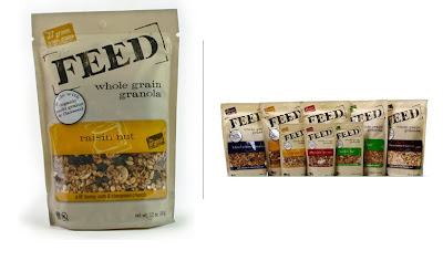
Feed. Not food. Not feeding food. Just "feed." The name implies a connection to domestic farm animal food (e.g. cow feed), which of course is not interpreted literally by viewers so as to be intended for bovine consumption, but is semiotically connected to the farm, the homegrown, and thus the natural.
The use of light brown as the dominant package color reinforces this connection. It is not white, which would connote bleaching. Let's look at sugar for a minute. Domino white sugar is posited against Sugar in the Raw. The former is refined, processed, and therefore removed from the land. Accordingly, Domino's logo is dyed blue laid out on a yellow, blue and white package. Although this is obviously unhealthy, people still buy this brand that they understand is processed -- it looks pretty, white and confectionary. And cakes are envisioned as white frosted things, which strengthens the connection of white processed sugar to white -- unhealthy -- birthday cake. Sugar in the Raw has the same method of imprinting its brand, albeit as the the natural, unprocessed, close-to-the-land sugar. It comes in brown paper packages and has one-color printing, which implies a lack of dyes. It is good to remember that dyes are not good since they have been linked to cancer... re: Red #40.
One can then see the parallel for Feed granola -- they are not the Domino of the granola industry. Their position as a supremely natural, of-the-land, homemade, organic granola is a strong one and should not be tampered with. Accordingly, their package design is very good not just in terms of working the principles of design and all of the formal stuff that works subconsciously in our minds, but in terms of the visual components of the package design fitting perfectly with the brand ethos.
How does it accomplish this? We've already looked at the color of the package as a balanced brown that conveys natural without being too heavy in the brown-paper-bag hue. Even in tactility it succeeds as natural because if you pick up a package it doesn't have that shiny, slippery plastic feel because of the matte color applied to the package. Because of its light color, the actual brown used falls into a beige category that enables it to work harmoniously with the various colors of each flavor. Goldenrod yellow. Apple green. Cranberry red. Cacao brown. Even the individual flavor colors avoid the red #40 dye trap; they are pulled from colors found in nature that correlate with the flavor. They succeed by using color hues that are not very vibrant, as that would imply unnaturally man-made like, for example, the colors and flavors of Life Savors candy. Utterly inorganic.
The [FEED] colors are great choices. The rest of the package design is subdued enough to allow each flavor color to stand out with richness. The typography does not compete with the flavor indication, nor does it overwhelm the logo. [FEED] is the dominant typographic element due to its large scale and the use of eye-focusing brackets. Also, the proportions work so that the logo space is 50% of the front and the flavor/actual product takes up the other 50%. But it all remains balanced because of the visually heavy presence of the [FEED] logo. In addition to scale, the heavy presence is also achieved by using a dark color. Black would be too severe and would not work within the natural-brown-woodsy-land brandsphere. Instead, a dark brown is used. This color is also used for the other extraneous, albeit necessary, typography like the "whole grain granola" product descriptor, the weight, the kosher seal, etc on the bottom. The result is unity. Using white and/or black and/or gold and/or orange, etc. for the non-logo typography would undermine the beautiful unity that is found in the current package design. Consider the typeface used for the logo, the "whole grain granola," and the flavor name such as "raisin nut." It is of the same family, which again achieves harmony and unity. The use of uppercase for the logo makes it distinct from the other type on the package. And the use of lowercase for the others puts these typographic elements together in one secondary group, thereby simplifying the visual "load" of elements. The use of a serif typeface is a throwback to ye olde time of general stores, which again underscores the homegrown feel of the brand. To render the type in a modern sans serif face like Univers would make Feed jump over to the Domino sugar, refined, machine-made, inorganic brandspace.
Other stuff. The diagonal positioning of [FEED] is really smart. Diagonals in design are very dynamic and help guide the eye while they simultaneously balance the layout. The circular element that highlights a feature of the product (contains flaxseeds -- yay!), stands out because 1) it is a circle 2) it is white and 3) it overlaps other mainstay elements in the design. But this isn't bad. It doesn't detract from the brand's visual identity because, simply by being a foreign white circle, it isn't an integrated part of brand. Seeing the actual product through a window is always good. In this case the product -- since it is marvelously all natural and scrumptious -- matches the color palette. But the window also works proportionally because it takes up 50% of the space in that rounded-corner box. The other 50% is occupied by the golden yellow flavor elements. The result is a balanced weight, which is pleasing to the eye.
All that said, the product is great. And great products deserve great design. Kudos.

 It appears that the red+white+blue+circle scheme has exceeded its capacity for unique logo generation. Although it does seem that the Missile Defense Agency's graphic designer is a republican with a beach-boys and/or McCain fetish. The new logo (center) has an unmistakable resemblance to the Iranian Space Agency's logo, however the latter's iconography is not as aggressive. One could argue that the ISA's logo depicts each of our solar system's rings as white lines with the red circle being the moon and the white circle (the negative space that eats into the blue circle that contains the orbit rings) being the earth -- the proportions seem accurate. That single dark line in the shape of an oval represents the earth's orbit.


