2.26.2010

MISSILE DEFENSE AGENCY

It appears that the red+white+blue+circle scheme has exceeded its capacity for unique logo generation. Although it does seem that the Missile Defense Agency's graphic designer is a republican with a beach-boys and/or McCain fetish. The new logo (center) has an unmistakable resemblance to the Iranian Space Agency's logo, however the latter's iconography is not as aggressive. One could argue that the ISA's logo depicts each of our solar system's rings as white lines with the red circle being the moon and the white circle (the negative space that eats into the blue circle that contains the orbit rings) being the earth -- the proportions seem accurate. That single dark line in the shape of an oval represents the earth's orbit.

Now let's look back at the MDA's new logo. It is easy to interpret the iconography as a missile bomb-bomb-bombing Iran. How? The circle of negative space (seen as light blue here) represents earth, as the U.S. tends to create visual identities and logos that are overwhelmingly directly connected to us since we perceive ourselves to be the center of the universe. The narrowing of the red band implies perspective (big to small or wide to narrow) and just happens to be going from about the location of where the U.S. would be to the location of where Iran would be on a globe. As the name implies, the MDA deals with missiles so it would make sense to depict a missile in the logo. And the star? An explosion? The sun? Who knows. The imagery is cryptic, but what else could that red band be?

2.22.2010

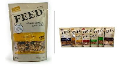
FEED ME

Feed. Not food. Not feeding food. Just "feed." The name implies a connection to domestic farm animal food (e.g. cow feed), which of course is not interpreted literally by viewers so as to be intended for bovine consumption, but is semiotically connected to the farm, the homegrown, and thus the natural.

The use of light brown as the dominant package color reinforces this connection. It is not white, which would connote bleaching. Let's look at sugar for a minute. Domino white sugar is posited against Sugar in the Raw. The former is refined, processed, and therefore removed from the land. Accordingly, Domino's logo is dyed blue laid out on a yellow, blue and white package. Although this is obviously unhealthy, people still buy this brand that they understand is processed -- it looks pretty, white and confectionary. And cakes are envisioned as white frosted things, which strengthens the connection of white processed sugar to white -- unhealthy -- birthday cake. Sugar in the Raw has the same method of imprinting its brand, albeit as the the natural, unprocessed, close-to-the-land sugar. It comes in brown paper packages and has one-color printing, which implies a lack of dyes. It is good to remember that dyes are not good since they have been linked to cancer... re: Red #40.

One can then see the parallel for Feed granola -- they are not the Domino of the granola industry. Their position as a supremely natural, of-the-land, homemade, organic granola is a strong one and should not be tampered with. Accordingly, their package design is very good not just in terms of working the principles of design and all of the formal stuff that works subconsciously in our minds, but in terms of the visual components of the package design fitting perfectly with the brand ethos.

How does it accomplish this? We've already looked at the color of the package as a balanced brown that conveys natural without being too heavy in the brown-paper-bag hue. Even in tactility it succeeds as natural because if you pick up a package it doesn't have that shiny, slippery plastic feel because of the matte color applied to the package. Because of its light color, the actual brown used falls into a beige category that enables it to work harmoniously with the various colors of each flavor. Goldenrod yellow. Apple green. Cranberry red. Cacao brown. Even the individual flavor colors avoid the red #40 dye trap; they are pulled from colors found in nature that correlate with the flavor. They succeed by using color hues that are not very vibrant, as that would imply unnaturally man-made like, for example, the colors and flavors of Life Savors candy. Utterly inorganic.

The [FEED] colors are great choices. The rest of the package design is subdued enough to allow each flavor color to stand out with richness. The typography does not compete with the flavor indication, nor does it overwhelm the logo. [FEED] is the dominant typographic element due to its large scale and the use of eye-focusing brackets. Also, the proportions work so that the logo space is 50% of the front and the flavor/actual product takes up the other 50%. But it all remains balanced because of the visually heavy presence of the [FEED] logo. In addition to scale, the heavy presence is also achieved by using a dark color. Black would be too severe and would not work within the natural-brown-woodsy-land brandsphere. Instead, a dark brown is used. This color is also used for the other extraneous, albeit necessary, typography like the "whole grain granola" product descriptor, the weight, the kosher seal, etc on the bottom. The result is unity. Using white and/or black and/or gold and/or orange, etc. for the non-logo typography would undermine the beautiful unity that is found in the current package design. Consider the typeface used for the logo, the "whole grain granola," and the flavor name such as "raisin nut." It is of the same family, which again achieves harmony and unity. The use of uppercase for the logo makes it distinct from the other type on the package. And the use of lowercase for the others puts these typographic elements together in one secondary group, thereby simplifying the visual "load" of elements. The use of a serif typeface is a throwback to ye olde time of general stores, which again underscores the homegrown feel of the brand. To render the type in a modern sans serif face like Univers would make Feed jump over to the Domino sugar, refined, machine-made, inorganic brandspace.

Other stuff. The diagonal positioning of [FEED] is really smart. Diagonals in design are very dynamic and help guide the eye while they simultaneously balance the layout. The circular element that highlights a feature of the product (contains flaxseeds -- yay!), stands out because 1) it is a circle 2) it is white and 3) it overlaps other mainstay elements in the design. But this isn't bad. It doesn't detract from the brand's visual identity because, simply by being a foreign white circle, it isn't an integrated part of brand. Seeing the actual product through a window is always good. In this case the product -- since it is marvelously all natural and scrumptious -- matches the color palette. But the window also works proportionally because it takes up 50% of the space in that rounded-corner box. The other 50% is occupied by the golden yellow flavor elements. The result is a balanced weight, which is pleasing to the eye.

All that said, the product is great. And great products deserve great design. Kudos.

2.19.2010

FRIDAY CAT BLOGGING

2.13.2010

QUICKIE ART HISTORY


This poster by Vuk Vidor embodies what good advertising people do -- make a brand "stand for" a one or two-word something. e.g. Volvo - safe; Sony - style

It is a simple, clear system and allows us to remember a name or brand that would have otherwise vanished into obscurity should similar others try to shout alongside or above it. Perhaps our interest in this paring down of concepts and categorizing just comes down to our limited memory capacity. We are living in the Information Age and thus have little "metanarratives" of data thrown at us constantly without any imaginable end point. PDAs, computer data, email, blog rolls, taxi tv, wild postings, bus ads, radio, t.v., ipod music, etc. We seek out knowledge and knowledge seeks us out. Quite frankly, it's overwhelming and a little scary. But that's going to be the struggle of humanity for the 21st century and beyond. A theme worth exploring through the arts.

2.11.2010

DEEP THOUGHT


(Not enough arm hair to be The Wolfman)

2.06.2010

LINES OF LANGUISH


Sharp. Hard. Focus. Evans' Depression-era photographs find beauty and respectability in impoverished conditions. While they seem to tell a story, they actually might not. Instead, Evans provides a blank gaze for us to construct our own stories for what we see. His photographs of people confront, but since they do so in such a strong and dignified way, the viewer's expected feelings of empathetic distress are quickly quashed by the disconnect, thereby compelling the viewer to think the image through.

In his photographs of interiors and exteriors -- such as the image above -- Evans is able to produce a lyricism that naturally permeates the shot simply because of his sensory intake of the immediate environment, which in this case is a poverty-stricken farm in late 1930s Alabama. In other words, the subjects he has already taken photos of have impacted him so that his unconscious guides him to shoot interiors and exteriors that echo the same dignified distress as the people. This particular photograph, which seems to be of the saddest kitchen shelf one could ever imagine, invites us to construct a reality. A reality perhaps of the worn mother using the last of the salt for dinner or a ragged young girl cleaning the two forks she shares with her whole family. The absence of people makes the viewer want to put them back in.

Visually, the stark contrast of the black and white allows the worn texture of the wood grain to become acutely apparent. The element of line is very forceful, especially in how the straight verticals of the wall planks are bisected by imperfect, bent diagonals. Since eyes are naturally drawn to circular forms, upon first glance a viewer may first see the ring hanging on the left before being carried to the right by the long horizontal shelf. But there is one magic element that pulls this photograph together so that without it, this print would not have made it out of the darkroom. It is the visual anchor: the dark rounded canister hanging to the right of the salt shaker. If you blot it out with your thumb, the photo just washes over because of the loss of that stopping point. It works by grabbing your gaze so that you linger and are forced to process the photograph as a whole.

1.29.2010

FRIDAY CAT BLOGGING

1.26.2010

FISCHL'S CRACKS OF DISCOMFORT

Eric Fischl. Daddy's Girl. 1984. Oil on canvas. 198 x 78 in.

In a century from now what will be Eric Fischl's artistic oeuvre? Dali makes us startle. Matisse makes us smile. And Fischl? Fischl makes us uncomfortable.

His work is imbued with thick tension as he captures tantalizing juxtapositions by camera that would otherwise have been lost in the nanoseconds of time. Within those photos are split seconds that represent the "cracks" of the world he is witnessing that then get transposed onto canvas. More than that, however, the man himself exudes his oeuvre. Those in his physical presence are made uncomfortable by Fischl's words, body language, subtextual sexual innuendo, hidden metaphors, etc. and one is left to wonder if Fischl even realizes that he is doing it. Just as Salvador Dali was surrealist showman, Fischl is discomfort.

The painting above, Daddy's Girl, emerges from the discomfort inherent in our anxieties and problems concerning the naked body. Fischl readily accepts this confrontation as a look into what appears to be a friendly look at a summer day on high cliffs of St. Tropez. Blue sky. White-hot house. Flip-flops. Cold glass of ice tea. As relaxing as this scene seems, it is belied by the classic Fischl tension that is always found in the details. For instance, one of Fischl's last additions to the composition is a very quenching glass of ice tea that may teeter off the ledge at the slightest touch of wind. This glass is placed between the characters and the viewer, thereby connecting the viewer's gaze intimately to the scene; it feels as though we're sitting in the painting at eye level with the drink, which is right in our reach. The glass also stands out a visual stopping point, balancing out the blue of the sky as its complementary colour. Another detail is the staircase that leads up to a rail-less balcony from which a little toddler could easily tumble. And the dangling flip-flop that is about to fall off. Clearly there is a running theme of "falling," which itself doesn't really matter; it is the "almost," the moment right before the fall, that is fun for Fischl to psychologically exploit.

As the title of the painting says, however, the subject of the painting is the people. The position of the little girl on top of her daddy is that of a very close embrace. But wait. It seems as though the girl is struggling to get off. How old is that girl? Why are these people naked? Wait, is that his... oh, nevermind. When he began this painting, Fischl asked himself, "what's wrong with flesh-on-flesh?" The image above features a man hugging a little girl. There's nothing really askew, yet we don't trust that because the two figures are alone. And in knowing that, we start to build a narrative and concede that if something was to be going on, we would not be able to stop it. Or we think that there could be something going on unconsciously between them. Suddenly the viewer of the painting is conscious of her own perverse and lewd expectations.

It's a very uncomfortable position.

1.20.2010

WAIT, WHO WON?


1.15.2010

WEATHER WONDERINGS


Top: weather.com, Bottom: weatherunderground.com

Two of the main web sites that let us know if we're wearing sandals or sweaters today are Weather.com and WeatherUnderground.com. While in theory they should provide the same data, the reality is that Weather.com looks, well, really bad in comparison to the less-fancy, but gauge-driven WeatherUnderground.com.

From a brand perspective, Weather.com (The Weather Channel) seems to have the upper hand with its absolute name and the same trusted blue-square logo from the teevee heydays. But such is not the case. In the early 2000s The Weather Channel wanted to capitalize on greater ad dollars, which they thought was possible through developing original programming. Big mistake. We just wanted our weather on the :08s... a little radar... humidity... maybe even some averages and records. Alright, we'll take the talking heads. Paul Goodloe, et al. But they forgot -- or just ignored -- that viewers tuned into that channel to get the information they needed in a succinct forecast, not to see how people in Kansas chase down thunderstorms. That same fatal error has been carried over into Weather.com so that it becomes annoying difficult to get the information that we came to the web site for in the first place.

Despite the unsophisticated logo and a coincidental name relation to a terrorist group, Weather Underground has the upper hand. Now more than ever we seek out information that we want fully and immediately. Weather forecasts inherently come with oodles of numerical data that can be presented in a variety of ways. The appeal of Weather Underground is that they understand this and thus seek to give us data in a glance that has a visual likeness to the information aeronautical professionals use.

On the left hand side of the Weather Underground's local weather page there is a bordered box that calls out the important stats: temp, wind, humidity, pressure, visibility, UV index, etc. We also get a thumbnail of radar in a glance that we can choose to enlarge. If we have the time, our eyes may then sweep to the right to take in the 5-day forecast in one gulp. The colour-coding of the high and low temps and percentages of precipitation lets us take in this information even faster. There are also all sorts of other goodies that we can check out if we want to: latitude and longitude, astronomy, diverse radar views, the time, and even a WunderPhotos gallery for especially interesting weather-related photos. All of this is condensed into the default viewing space of the browser window. The difference between the two web sites is stark in the screenshots that appear above. Conclusion: Weather.com provides 5% of the information Weather Underground provides in the same amount of space.