10.26.2010

CREATIVITY IS KEY


In the world of in-store bulletin boards, a creative execution really stands out. Such as this ad we reviewed last year. Here, the piano tuner exploits the product's appearance by visually linking it to the take-away in a mostly successful ad. Additionally, leaving out names lets the company name do the talking, which gives it credibility and legitimacy in a media space where anyone could tape up a flyer. The typeface party on the other hand...

10.20.2010

DOES AND DOES NOT SUCK


Paper drinking straws! When purchased in bulk they are just 2¢ each. The benefit for retailers using these is two-fold: 1. being environmentally responsible and 2. letting customers know your company is environmentally responsible. The latter results in a very positive association with your brand.

10.13.2010

__________________

Better late than never. Axing Arial is always a good idea. One day it will join BrushScript, Mistral, and Papyrus in the heavens.

The new MySpace logo is a success and failure. What do we see here? No color. Two letters and a horizontal bracket (in balanced alignment). No .com. No icons. Just a visual pun.

The clarity and simplicity is surprising to see in light of the cluttered and complicated design of their current web site (which will also be redesigned by the end of the year). Eliminating the clutter and tightening up the interface was probably high up on the design brief. As was differentiating itself from Facebook, which also uses a blue color palette. Check and check. There is also an interactive element that has the potential to be amusing. (Screen shots here.) The interactivity seems to be akin to some of the Google Doodles.

Let's consider a bigger question. What does this new logo stand for and how does it affect the MySpace brand identity? Over the past several years MySpace has been sinking as Facebook innovated and implemented design thinking. But we're getting to a point where the social networks can diverge. Facebook is an expanded rolodex that enables people to communicate and learn about their contacts' lives. It started by being restrictive to college students with .edu email addresses and still remains a "closed" network. MySpace began as an "open" network—a wild west of sorts. Anything went: fake profiles, spam, porn, bad html. You could search for and "friend" (verb) anyone. But it got too big and unwieldy. The layout of the web site became cluttered and confusing with very intrusive banner ads. MySpace turned to garbage. But then they ramped up efforts in the music artists section, which gave up-and-coming musicians a platform to showcase their work. Now that's different. MySpace can survive by realizing what it isn't (Facebook) and working what it is... a way for people to discover new media: musicians, comedians, and filmmakers. These are people you do not have to personally know in order to connect with interactively.

Returning to the logo design, it seems more like an advertising and promotional tool than a brand identity. For example, the MySpace business card with the logo enables employees to draw in their own personal doodles for customization. The brand identity conveyed by the logo, however, speaks to the vast openness and "anything goes" attitude that makes MySpace stand for any thing. Such a position is too broad and generic. Its home page looks like Yahoo! or any other token entertainment web portal. Not having a color palette fits with their [insert here] brand positioning, but at the same time it sacrifices distinction.

The simplicity of logo design is a big step forward, though, and MySpace is coming into an identity independent of an interpersonal social network model like that of Facebook.

10.11.2010

A NEW WAY TO LEARN ABOUT THE BEATLES

A good example of statistical information sourcing. Despite its trivial content the image is creative and fun. Information Design is not reliant exclusively on quantitative data.

9.23.2010

THE NEW BOOK

Building a community by the book. By IDEO, a design and innovation consulting firm. Crazy hyper-future land. Prepare for head explosion.

(This video has great art direction, especially with the use of color as organization tool. Yellow, Turquoise Blue, Red.)

The Future of the Book. from IDEO on Vimeo.

LIVING BUILDINGS


OpenBuildings' header imagery is charming in its simplicity. Their mission is to aggregate and organize great examples of architecture across the world by using crowdsourcing. Orange is a lively, fresh, and energetic color that fits with the dynamicism and creation inherent in building. The curved line feels like a heart monitor, which brings the design the association of life and vitality. The rounded corners help the design feel friendly and the buildings found therein are as simple as possible while still in possession of individual characteristics such as columns or round, left-justified windows.

9.08.2010

NEW TOC-ING


Who says a table of contents has to be a list of topics in order of appearance? Sometimes this is not useful to an author's book. Perhaps writers should take a stab at information design and come up with alternate ways of presenting their information concisely. David McCandless supplants a traditional table of contents in his data visualization book, The Visual Miscellaneum, with headings drawn to prominence by use of scale (big), shape (circles naturally attract the eye), and color (basic coding technique). He creates a deservingly simple two-level organization with the type of graph as the first (Pop, Health, etc.) and the location or page number as the second, deeper level.

9.04.2010

FILM PROMOS... 60s STYLE


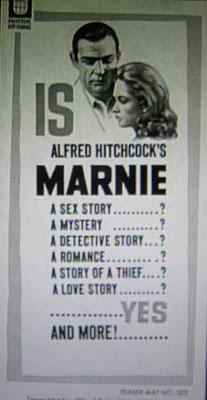
A great film deserves a great promotion. Even in 1964.

Alfred Hitchcock's Marnie is a complex psychological drama about a beautiful compulsive liar and thief (Tippi Hedren) who helps herself to her various employers' safes and vaults before changing her address and identity. One of her bosses (Sean Connery) falls for her and uncovers the truth behind her actions, but takes her as his wife rather than sending her to jail as he gets at the root psychological trauma. It has been said that Marnie is like a culmination of Notorious (1946), Rebecca (1940), and Spellbound (1945). Its cinematic triumph is the use of framing and its exquisite color palette.

The film was introduced to audiences with a bang in July of 1964. In the lead up to the release, there was a contest with the theme of "Who is the Prettiest Secretary," which surely grabbed female audiences. Then at the actual opening night select movie theaters displayed a large safe that was filled with merchandise from neighborhood retailers (jewelry, clothing, gift certificates, etc.). Moviegoers were invited to take their shot at cracking the safe, for if they succeeded the contents would be theirs.

An assortment of movie posters were created billing it as Alfred Hitchcock's "Suspenseful Sex Mystery" with headlines like the below. In the image above, the list begins and ends with the most powerful selling points: sex and love. Additionally, the borders are designed in a modern 1960s style, which again sells it to a younger, more culturally immersed audience that doesn't want their mother's same old romantic movie.

Selection of poster headlines:

"On Marnie's wedding night he discovered every secret about her... except one!"
= Allowing the viewer's mind to wander to interesting places to figure it out, creating expectations they want to know will or will not be met in the actual film

"Thief...Liar...Cheat...she was all of these...and he knew it!"
= Painting a character will ill traits and adding second level of intrigue with a "he"

"Only Alfred Hitchcock could have created a woman —so mysterious —so fascinating —so dangerous as Marnie"
= Banking on Hitchcock's directorial star power as well as setting up intrigue for a character

"Alfred Hitchcock's love stories start where others fail to go!"
= Banking of Hitchcock's directorial star power and asserting success via the negative "fail"

9.03.2010

THEY SEE THE SAME STYLIST

These two men have something in common besides a big bottle of peroxide: Christianity. Or, perhaps more correctly, religion as a means of maintaining power and a position in the far right wing. Bill Keller (left) is a salesman turned insider trader turned jailbird turned television evangelist. And Geert Wilders (right) is a Dutch Freedom and Democracy party politician turned Group Wilders politician turned "Freedom" party politician. Both men fuel their existence by attacking Islam and advocating for things like banning the Qur'an and taxing Burqua-clad women while they peddle the Islam-as-religion-of-hate-and-death bigotry.

Keller and Wilders both sport bleach-blond hair, which is a curious similarity given the above. They each strive for pure whiteness of the follicle and subsequently go to great lengths to achieve such "purity." Of course both are on television and are in the public eye so image is everything. They want to stand out. But why blond? Perhaps the extreme brightness and lightness on their crowns helps them better piggyback onto the God connection. And pumping up the volume on their hair is a gesture meant to reach up to get them even closer to the heavens. Pure. Clean. White. Light. Right. Divine. The world is mine.

FRIDAY CAT BLOGGING