5.05.2011

MTA FIX

Looks like I won't have to pull out the black electrical tape for some DIY design fixin'. The MTA finally nixed the superfluous list numbers!

Maybe it's just that I take the 2 and 3 trains quite a bit, but those numbered numbers were really bothersome.

4.30.2011

HOT SOCKS


An innovative package design by Jackson Dickie for... socks. The minimal white cardboard tag lets the texture and color of the sock stand out. Silver rivets lend weight to the brand with a vintage-modern feel. Beautiful.

4.25.2011

ICEBERG AHEAD!

Giant inflatable iceberg (14' high with 102 handholds)

This is design thinking.

Taking a Problem: Fun way to enjoy the water in your backyard (if you live in Florida).
Innovating: "Something that doesn't belong, that involves exercise, that is fun, that provides a view, and that doesn't look ugly."
Good Design: Clean texture, Crisp white

3.10.2011

MTA FAIL... AGAIN


Well it looks like the MTA has finally caught up to 1988. They are currently installing digital signs that indicate when the next trains will arrive.

Problem #1: The extra "1." before the actual train number (1) is unnecessary. It is superfluous since the list is so short that we do not need numbering. Plus it is visually confusing to have the numbering next to trains that themselves are numbered.

Problem #2: The LED dot matrix display is up to date... in 1988. The point of using the flip-dot display is to use on large (no) outdoor (no) signs that usually will be exposed to direct sunlight (no).

Problem #3: Sometimes they are wrong.

HELPING OUT

A man in need of financial assistance put a bit of marketing magic into asking for donations. He slipped into a Starbucks and as he walked by the tables he discreetly placed a pen onto each table where people were sitting. Attached to the pen was a small slip of paper that said something to the effect of: These pens are for my family. I am deaf and would appreciate $1.00 or $2.00 for this item. He walked back to collect back the pens and any donations people were willing to provide.

Benefits of this idea:
1. Does not disturb Starbucks patrons or staff
2. Gives each person a minute to think about donating
3. Provides a product—a pen—that someone sitting at a Starbucks may actually need

2.22.2011

INFORMATION DESIGN FINDS PROFITS


Finally a way to make money from information design. A big problem in the field has been financing since the private sector has largely ignored the value of data visualizations. But now a company called Column Five Media has injected PR into the mix so as to position information design as an asset since it comes with press and guaranteed brand impressions. So now companies like TurboTax are using good design as a way of advertising by giving consumers valuable information. Pretty fucking smart.

2.09.2011

MTA CHUTZPAH


Copy: "Instead of developing transit apps ourselves, we gave our info to the people who do it best."

Now if only they would lend some of that improvement to the G train. It would be easy because every single thing about that train needs help.

1.21.2011

GOTTA GETTA GATE


Even if you don't have babies. The design of this gate is spectacular. There is something especially appealing about the tranquility of the repeated horizontal lines. Perhaps the appeal stems from the pleasure of knowing there is something so serene and harmonious to be found in the realm of loud, messy babies. It is also a reminder that sometimes it doesn't take very much to get away from bad design.

FRIDAY CAT BLOGGING

1.05.2011

DEEP THOUGHT

ANOTHER CEO GOT BORED


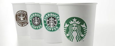
Well. It is usually the case that bringing simplification to a company's visual identity is a good thing. The new Starbucks logo might be the exception.

Of all the Starbucks logos above the nicest is the first one on the far left. It is in an earthy coffee brown color in a friendly, imprecise, stamp-style print with a unique image (nude sea nymph/siren) that communicates authenticity and a tie to soil. But alas, this is too authentic for what is now a 16,858-store chain. So let's go with the next best thing. Give it a slick, solid type treatment for the brand name with a slick, solid icon. The most recent version did just that and so settled in to a strong brand positioning in our commercial landscape.

Uh-oh. The CEO got bored. The company now wishes to "expand their business" and so nixed the name in lieu of what Starbucks executives are probably now mistakenly lauding as a cleaner, modern, and more visually-appealing design. Wrong.

The nymph alone doesn't communicate a "starbuck." This new design vaguely references the sea (Starbucks originated in Seattle and the name refers to a character in Moby Dick). And it references previous iterations of itself. Not the product. I don't see any beans, steam, cups etc.

Final verdict: the new logo is too pared down. And they're going to need to write their name out on something at some point.

1.04.2011

TECH PORN: TIES THAT BOND

installation, Riflemaker Gallery (April 2007)


A humorous art piece by John Maeda. From what seems to resemble something of a love knot, we can infer some kind of union created by two white Apple ipods. They are connected to something by one wire cord that vanishes into the wall. The juxtaposition is such that the tilt and downward position of the ipod on the right resembles something of a nuzzle. Alternatively, the tilt could be seen as an aggressive ram, which would be underscored by the screen images that reflect a jostling.

Since Maeda is a scientist-artist, let's go ahead and make some geeky interpretations. An initial reaction to the above observation is seeing the two as people. Even when objects do not look like people, we can find it easy to imagine what types of human characters they could have. A couple. Male and female. One interpretation is labeling the sex of each ipod as male and female using a genetic, chromosomal lens where XX is female and XY is male. Hmm. Now mathematically, the x-axis of a graph is horizontal and the y-axis is vertical. Since the ipod on the left has many vertically-oriented bars of color we could deem this male (linking to the Y in XY). Or, more simply, the vertical lines of the left ipod could signify height and the horizontal lines of the right ipod could then refer to width. Biologically, men are taller than women and women are "wider" through their curves.

Through this deliberate arrangement, Maeda could have implored viewers to personify the technological devices. By doing so we see ourselves in the technology. It is an extension of the self. A viewer of this exhibit literally sees him or herself in the screen's reflection. Could Maeda be probing the observation of the loyal, unshakable attachment people have with their personal technology devices (PDAs, mobile phones, smartphones, ipods, etc.)? Mere plastic and metal. A lifeless 4.7 ounces.

12.22.2010

MINIMALISM VS SIMPLICITY


There is a tendency for designers to embrace minimalism. Or at least they happily claim to do so. However, the reality is that what turns them on is not minimalism; it is simplicity. There is a difference. Minimalism—spinning into everyday culture through its origin in the 1950s as an art movement—is about starting from nothing and having less so as to keep things to a bare minimum. It leans toward an extreme. Simplicity, on the other hand, possesses a greater degree of humanity by reducing things while still maintaining ideal functionality. For example: imagine a modern kitchen. The minimalist kitchen started from zero and adds in perhaps a few juice glasses on a recessed shelf along with maybe five pots and pans hanging on the wall. There is a single sponge, but no soap. That's it. We all know that we need many things for a kitchen to function such as a coffee maker, dish soap, toaster, napkins, paper towels, etc. But do we go ahead and put the blender, smoothie glasses, and an ice bucket on the counter? No. We keep it simple by finding a happy medium. In the images above a designer has applied minimalism to package design. The corn flakes become very generic and is stripped of a juicy image of the product, which factors into consumer purchase decisions. The Nutella, on the other hand, can live with this minimalism because the product itself is visible through the glass jar. One problem with all of this is that removing color and personality from the logos detracts from the brand identity.

Something minimalism lacks that simplicity has is the art of arrangement. Being simple requires the ability to arrange with purpose and perception. There is a whole book on the subject called Arranging Things: A Rhetoric of Object Placement.

12.18.2010

DON'T TELL ME THEY ACTUALLY LEGISLATED

Detail of map

The New York Times
did a nice job with the information design of the graphics showing how the Senate voted to repeal the military's "Don't Ask, Don't Tell" policy. There was an emphasis on clarity here, as the details were kept to a minimum and the graphics were boiled down to bare minimum. For example, the designer used the typical red and blue colors to indicate party. But s/he did so in such as way so as to keep those colors, using slight modifications, to indicate three different data sets: Yes, No, and Didn't vote. It was smart to group the "No" and "Didn't vote" groups vis-a-vis desaturated color. I do wonder, however, if the map would be an even easier read if the "No" squares had the diagonal lines in the fully saturated color. Or... perhaps the designer intentionally made the "No" squares desaturated in the same tones as "Didn't vote" so as to make the viewer optically group those together, leaving the "Yes" squares to stand out since they're the only saturated colors. This then creates an emphasis on the "Yes", which is to say the passage of the vote. It is subtle, but this designer manipulated information to propagate the "Yes" (it's about damn time!) vote.

I think that in the future, several generations from now, when we see maps like these, we'll absorb them in one whole visual gulp without needing to put together the parts to make sense of a whole. These graphics do a really good job of hastening that gap closure.

12.13.2010

PLANK TREE AND MENORAH

In the vast world of Christmas decoration there is a fine line between tasteful and tacky. Get your design on by hanging a representation of a tree on your wall. How wonderfully simple and rustic. And a good example of appropriation.


And... a simple, rustic menorah to match.

11.24.2010

YORK NEW KNICKS

Top: current version; Bottom: Editor's suggestion

The York New Knicks got a new logo. Yay? There have been conflicting uses of the new logo. There is currently a subway ad campaign that features the logo in desaturated colors (closer to the bottom, edited version here, but much lighter). And there is the web presence that gives us blaring blue and orange (top). Sure, sports is, well, sports and so having robust colors imparts feelings of action and intensity, which works for a basketball team. But this comes at the price of a horrendous blue and orange combination. Perhaps the color discrepancy is an indication of this conflict: wanting a non-hideous logo, but at the same not not a dull, lifeless logo. Another problem is that the vertical balance is off because of the negative space surrounding the Y, which is the price of having the N and K balance each other out. Since the Y is so prominent, it screams above "New" and "Knicks." But on the hand it gives an emphasis to a crowd chant and is in linear order.

BLUE AND ORANGE


Boo.

11.18.2010

SIR PENGUIN, ESQ


A textural delight! It's not often that you see penguin ornaments let alone penguins dressed in plaid menswear. The use of red for the accessories unifies the group through color.

11.02.2010

CANDY COLOR

Jonathan Lewis created these prints using the color palettes of candy packaging as his inspiration. They are delightful in their simplicity as the viewer has that "ah-ha" moment of recognition. It seems as though he got the color proportions correct based on the amount of color in each package. Reminds me of Adobe's Kuhler color themes (see below).

BLUE AND ORANGE


Not so happy about this.