11.24.2010
YORK NEW KNICKS
The York New Knicks got a new logo. Yay? There have been conflicting uses of the new logo. There is currently a subway ad campaign that features the logo in desaturated colors (closer to the bottom, edited version here, but much lighter). And there is the web presence that gives us blaring blue and orange (top). Sure, sports is, well, sports and so having robust colors imparts feelings of action and intensity, which works for a basketball team. But this comes at the price of a horrendous blue and orange combination. Perhaps the color discrepancy is an indication of this conflict: wanting a non-hideous logo, but at the same not not a dull, lifeless logo. Another problem is that the vertical balance is off because of the negative space surrounding the Y, which is the price of having the N and K balance each other out. Since the Y is so prominent, it screams above "New" and "Knicks." But on the hand it gives an emphasis to a crowd chant and is in linear order.
Labels:
branding
11.18.2010
SIR PENGUIN, ESQ

A textural delight! It's not often that you see penguin ornaments let alone penguins dressed in plaid menswear. The use of red for the accessories unifies the group through color.
Labels:
design
11.02.2010
CANDY COLOR
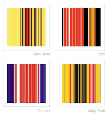
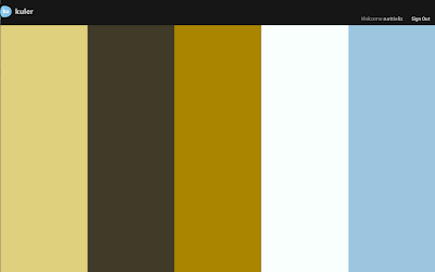
 Jonathan Lewis created these prints using the color palettes of candy packaging as his inspiration. They are delightful in their simplicity as the viewer has that "ah-ha" moment of recognition. It seems as though he got the color proportions correct based on the amount of color in each package. Reminds me of Adobe's Kuhler color themes (see below).
Labels:
fine art
ELECTION DAY
One glaring problem of the current ballot design is inclusion of the A, B, C, D, E party headings within the vertical space belonging to item 1. The headings are for the entire ballot, not just item 1. The list of problems goes on and on... too much bold type; paper orientation toward the parties not the actual office being voted on; unnecessary space devoted to language translation (how does a person's name translate from English to Spanish?); line strokes that are too heavy; etc., etc.
Let's hope this confusing design does not translate into voter confusion.
Labels:
design,
info design,
society
Subscribe to:
Comments (Atom)


