8.24.2010
GLASS OVER PLASTIC
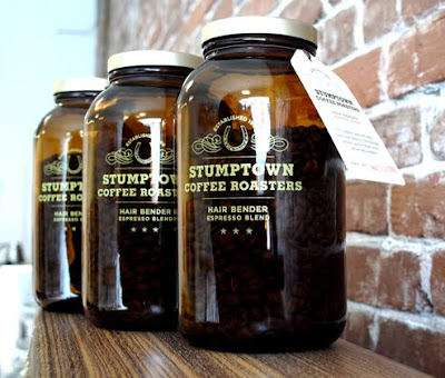
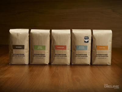
The amber glass for this special espresso blend hearkens back to the days of the general store and local apothecary. A vintage, homespun vibe goes along with Stumptown's brand ethos and really makes this product stand out, although without compromising the image of their usual brown paper packaging. It is also rare to see coffee beans in anything other than bags so the glass was a nice touch. Part of me wishes that this was pushed a bit more so that there was a different style of lid with texture or even laser engraving in the glass (like the example below).

Labels:
beverage,
package design
8.19.2010
MEMETIC CARTOGRAPHY
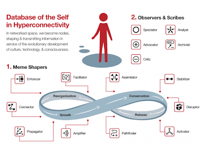
"Memetic Cartography" - concept mapping as evolutionary strategy; developed from the ideas of Charles Darwin and Richard Dawkins; a meme--like a gene--is an idea, belief, or pattern of behavior that is "hosted" on one or more individual minds which can then reproduce itself from mind to mind.
Conceptual framework for online identity roles by Venessa Miemis that shows how individuals interact with information online. She breaks the roles down into idea shapers, observers and scribes. This is a great example of how design is an important skill for information age data processing. Human brains are slowly having to adjust to interpreting data like never before: infinite quantity, organization, and synthesis. Welcome to the future.
p.s. check out those icons... so simple, clean, and direct!
Labels:
info design
8.10.2010
8.05.2010
INTERNATIONAL INFORMATION
Simplicity of digital design for the tram cars in Amsterdam. Just the bare essentials. In equal weight for visual unity.
Labels:
info design
ANOTHER CEO GOT BORED


The package re-design for Ciao Bella gelato is rather saddening. The previous design stood for something with its unique stark, simple packages that communicated by color and type. This new design seems to say, "Hey guys, look, I'm a real ice cream! Just like you! Look at my pretty photos!" While the category is a crowded one, there are not many deliberately Italian brands. The gelato found in Europe is really quite good and different from the ice cream in the U.S. To give that away for a visually crowded, origin-generic design is a resignation and a big part of the brand equity has been scooped away. Too close to Edy's and too far from Talenti.
Labels:
package design
DUTCH DESIGN: CUCKOO CLOCK
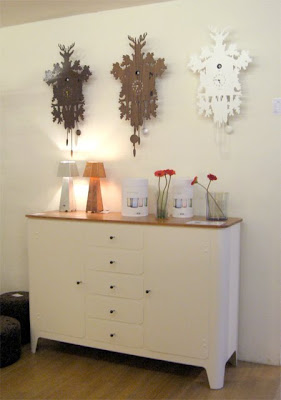
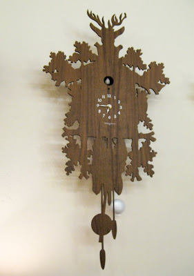
Human beings have always loved little birds popping out of boxes to remind us of the time. Automaton bird clocks came into fruition in the middle ages, but they gained steam in the early 18th century in the Black Forest in Germany. In the mid-19th century, expert woodcarvers created chalet-style casings with rich ornamentation carved three-dimensionally. This type of cuckoo clock--derived originally from the "Jagdstuck" design--has been popular since the mid-19th century and traditionally features hunting motifs such as deer heads, leaves, pine cones, guns, and oak foliage. The cuckoo clock has been a loved piece of kitsch for centuries.
The above cuckoo clock is a modern one in the style of the traditional clocks that was spotted in Dutch design heaven, The Frozen Fountain. Even though we want to reduce our surroundings for clean interior design as modernity almost mandates, we still want this kitschy decoration on the wall. With digital timekeeping, wall clocks are becoming irrelevant for time and relevant to interior design. The design of this clock has been stripped down so that as few details as possible are presented: wood, hunting motives, and the cuckoo bird.
The cuckoo is, of course, the most interesting part. Sound and spectacle. Why do we love to have a part come alive to remind us of the time?
Labels:
package design,
sculpture
Subscribe to:
Comments (Atom)


