12.22.2010
MINIMALISM VS SIMPLICITY
There is a tendency for designers to embrace minimalism. Or at least they happily claim to do so. However, the reality is that what turns them on is not minimalism; it is simplicity. There is a difference. Minimalism—spinning into everyday culture through its origin in the 1950s as an art movement—is about starting from nothing and having less so as to keep things to a bare minimum. It leans toward an extreme. Simplicity, on the other hand, possesses a greater degree of humanity by reducing things while still maintaining ideal functionality. For example: imagine a modern kitchen. The minimalist kitchen started from zero and adds in perhaps a few juice glasses on a recessed shelf along with maybe five pots and pans hanging on the wall. There is a single sponge, but no soap. That's it. We all know that we need many things for a kitchen to function such as a coffee maker, dish soap, toaster, napkins, paper towels, etc. But do we go ahead and put the blender, smoothie glasses, and an ice bucket on the counter? No. We keep it simple by finding a happy medium. In the images above a designer has applied minimalism to package design. The corn flakes become very generic and is stripped of a juicy image of the product, which factors into consumer purchase decisions. The Nutella, on the other hand, can live with this minimalism because the product itself is visible through the glass jar. One problem with all of this is that removing color and personality from the logos detracts from the brand identity.
Something minimalism lacks that simplicity has is the art of arrangement. Being simple requires the ability to arrange with purpose and perception. There is a whole book on the subject called Arranging Things: A Rhetoric of Object Placement.
Labels:
design
12.18.2010
DON'T TELL ME THEY ACTUALLY LEGISLATED
The New York Times did a nice job with the information design of the graphics showing how the Senate voted to repeal the military's "Don't Ask, Don't Tell" policy. There was an emphasis on clarity here, as the details were kept to a minimum and the graphics were boiled down to bare minimum. For example, the designer used the typical red and blue colors to indicate party. But s/he did so in such as way so as to keep those colors, using slight modifications, to indicate three different data sets: Yes, No, and Didn't vote. It was smart to group the "No" and "Didn't vote" groups vis-a-vis desaturated color. I do wonder, however, if the map would be an even easier read if the "No" squares had the diagonal lines in the fully saturated color. Or... perhaps the designer intentionally made the "No" squares desaturated in the same tones as "Didn't vote" so as to make the viewer optically group those together, leaving the "Yes" squares to stand out since they're the only saturated colors. This then creates an emphasis on the "Yes", which is to say the passage of the vote. It is subtle, but this designer manipulated information to propagate the "Yes" (it's about damn time!) vote.
I think that in the future, several generations from now, when we see maps like these, we'll absorb them in one whole visual gulp without needing to put together the parts to make sense of a whole. These graphics do a really good job of hastening that gap closure.
Labels:
info design,
society
12.13.2010
PLANK TREE AND MENORAH
In the vast world of Christmas decoration there is a fine line between tasteful and tacky. Get your design on by hanging a representation of a tree on your wall. How wonderfully simple and rustic. And a good example of appropriation.
And... a simple, rustic menorah to match.
Labels:
design
11.24.2010
YORK NEW KNICKS
The York New Knicks got a new logo. Yay? There have been conflicting uses of the new logo. There is currently a subway ad campaign that features the logo in desaturated colors (closer to the bottom, edited version here, but much lighter). And there is the web presence that gives us blaring blue and orange (top). Sure, sports is, well, sports and so having robust colors imparts feelings of action and intensity, which works for a basketball team. But this comes at the price of a horrendous blue and orange combination. Perhaps the color discrepancy is an indication of this conflict: wanting a non-hideous logo, but at the same not not a dull, lifeless logo. Another problem is that the vertical balance is off because of the negative space surrounding the Y, which is the price of having the N and K balance each other out. Since the Y is so prominent, it screams above "New" and "Knicks." But on the hand it gives an emphasis to a crowd chant and is in linear order.
Labels:
branding
11.18.2010
SIR PENGUIN, ESQ
A textural delight! It's not often that you see penguin ornaments let alone penguins dressed in plaid menswear. The use of red for the accessories unifies the group through color.
Labels:
design
11.02.2010
CANDY COLOR
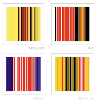
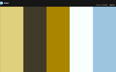
Jonathan Lewis created these prints using the color palettes of candy packaging as his inspiration. They are delightful in their simplicity as the viewer has that "ah-ha" moment of recognition. It seems as though he got the color proportions correct based on the amount of color in each package. Reminds me of Adobe's Kuhler color themes (see below).
Labels:
fine art
ELECTION DAY
One glaring problem of the current ballot design is inclusion of the A, B, C, D, E party headings within the vertical space belonging to item 1. The headings are for the entire ballot, not just item 1. The list of problems goes on and on... too much bold type; paper orientation toward the parties not the actual office being voted on; unnecessary space devoted to language translation (how does a person's name translate from English to Spanish?); line strokes that are too heavy; etc., etc.
Let's hope this confusing design does not translate into voter confusion.
Labels:
design,
info design,
society
10.26.2010
CREATIVITY IS KEY
In the world of in-store bulletin boards, a creative execution really stands out. Such as this ad we reviewed last year. Here, the piano tuner exploits the product's appearance by visually linking it to the take-away in a mostly successful ad. Additionally, leaving out names lets the company name do the talking, which gives it credibility and legitimacy in a media space where anyone could tape up a flyer. The typeface party on the other hand...
Labels:
ads
10.20.2010
DOES AND DOES NOT SUCK
Paper drinking straws! When purchased in bulk they are just 2¢ each. The benefit for retailers using these is two-fold: 1. being environmentally responsible and 2. letting customers know your company is environmentally responsible. The latter results in a very positive association with your brand.
Labels:
design,
package design
10.13.2010
__________________
Better late than never. Axing Arial is always a good idea. One day it will join BrushScript, Mistral, and Papyrus in the heavens.
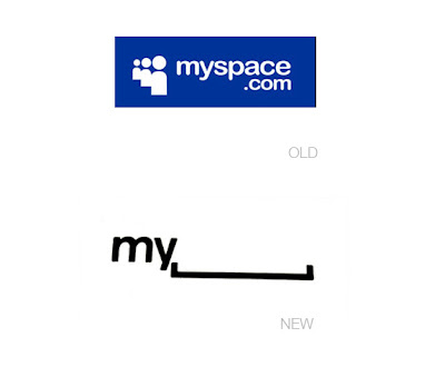
The new MySpace logo is a success and failure. What do we see here? No color. Two letters and a horizontal bracket (in balanced alignment). No .com. No icons. Just a visual pun.
The clarity and simplicity is surprising to see in light of the cluttered and complicated design of their current web site (which will also be redesigned by the end of the year). Eliminating the clutter and tightening up the interface was probably high up on the design brief. As was differentiating itself from Facebook, which also uses a blue color palette. Check and check. There is also an interactive element that has the potential to be amusing. (Screen shots here.) The interactivity seems to be akin to some of the Google Doodles.
Let's consider a bigger question. What does this new logo stand for and how does it affect the MySpace brand identity? Over the past several years MySpace has been sinking as Facebook innovated and implemented design thinking. But we're getting to a point where the social networks can diverge. Facebook is an expanded rolodex that enables people to communicate and learn about their contacts' lives. It started by being restrictive to college students with .edu email addresses and still remains a "closed" network. MySpace began as an "open" network—a wild west of sorts. Anything went: fake profiles, spam, porn, bad html. You could search for and "friend" (verb) anyone. But it got too big and unwieldy. The layout of the web site became cluttered and confusing with very intrusive banner ads. MySpace turned to garbage. But then they ramped up efforts in the music artists section, which gave up-and-coming musicians a platform to showcase their work. Now that's different. MySpace can survive by realizing what it isn't (Facebook) and working what it is... a way for people to discover new media: musicians, comedians, and filmmakers. These are people you do not have to personally know in order to connect with interactively.
Returning to the logo design, it seems more like an advertising and promotional tool than a brand identity. For example, the MySpace business card with the logo enables employees to draw in their own personal doodles for customization. The brand identity conveyed by the logo, however, speaks to the vast openness and "anything goes" attitude that makes MySpace stand for any thing. Such a position is too broad and generic. Its home page looks like Yahoo! or any other token entertainment web portal. Not having a color palette fits with their [insert here] brand positioning, but at the same time it sacrifices distinction.
The simplicity of logo design is a big step forward, though, and MySpace is coming into an identity independent of an interpersonal social network model like that of Facebook.
Labels:
branding,
interactive
10.11.2010
A NEW WAY TO LEARN ABOUT THE BEATLES
A good example of statistical information sourcing. Despite its trivial content the image is creative and fun. Information Design is not reliant exclusively on quantitative data.
Labels:
info design
9.23.2010
THE NEW BOOK
Building a community by the book. By IDEO, a design and innovation consulting firm. Crazy hyper-future land. Prepare for head explosion.
(This video has great art direction, especially with the use of color as organization tool. Yellow, Turquoise Blue, Red.)
The Future of the Book. from IDEO on Vimeo.
Labels:
design,
info design,
interactive
LIVING BUILDINGS
OpenBuildings' header imagery is charming in its simplicity. Their mission is to aggregate and organize great examples of architecture across the world by using crowdsourcing. Orange is a lively, fresh, and energetic color that fits with the dynamicism and creation inherent in building. The curved line feels like a heart monitor, which brings the design the association of life and vitality. The rounded corners help the design feel friendly and the buildings found therein are as simple as possible while still in possession of individual characteristics such as columns or round, left-justified windows.
Labels:
design,
interactive
9.08.2010
NEW TOC-ING
Who says a table of contents has to be a list of topics in order of appearance? Sometimes this is not useful to an author's book. Perhaps writers should take a stab at information design and come up with alternate ways of presenting their information concisely. David McCandless supplants a traditional table of contents in his data visualization book, The Visual Miscellaneum, with headings drawn to prominence by use of scale (big), shape (circles naturally attract the eye), and color (basic coding technique). He creates a deservingly simple two-level organization with the type of graph as the first (Pop, Health, etc.) and the location or page number as the second, deeper level.
Labels:
info design
9.04.2010
FILM PROMOS... 60s STYLE
A great film deserves a great promotion. Even in 1964.
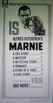
Alfred Hitchcock's Marnie is a complex psychological drama about a beautiful compulsive liar and thief (Tippi Hedren) who helps herself to her various employers' safes and vaults before changing her address and identity. One of her bosses (Sean Connery) falls for her and uncovers the truth behind her actions, but takes her as his wife rather than sending her to jail as he gets at the root psychological trauma. It has been said that Marnie is like a culmination of Notorious (1946), Rebecca (1940), and Spellbound (1945). Its cinematic triumph is the use of framing and its exquisite color palette.
The film was introduced to audiences with a bang in July of 1964. In the lead up to the release, there was a contest with the theme of "Who is the Prettiest Secretary," which surely grabbed female audiences. Then at the actual opening night select movie theaters displayed a large safe that was filled with merchandise from neighborhood retailers (jewelry, clothing, gift certificates, etc.). Moviegoers were invited to take their shot at cracking the safe, for if they succeeded the contents would be theirs.
An assortment of movie posters were created billing it as Alfred Hitchcock's "Suspenseful Sex Mystery" with headlines like the below. In the image above, the list begins and ends with the most powerful selling points: sex and love. Additionally, the borders are designed in a modern 1960s style, which again sells it to a younger, more culturally immersed audience that doesn't want their mother's same old romantic movie.
Selection of poster headlines:
"On Marnie's wedding night he discovered every secret about her... except one!"
= Allowing the viewer's mind to wander to interesting places to figure it out, creating expectations they want to know will or will not be met in the actual film
"Thief...Liar...Cheat...she was all of these...and he knew it!"
= Painting a character will ill traits and adding second level of intrigue with a "he"
"Only Alfred Hitchcock could have created a woman —so mysterious —so fascinating —so dangerous as Marnie"
= Banking on Hitchcock's directorial star power as well as setting up intrigue for a character
"Alfred Hitchcock's love stories start where others fail to go!"
= Banking of Hitchcock's directorial star power and asserting success via the negative "fail"
Labels:
film
9.03.2010
THEY SEE THE SAME STYLIST
These two men have something in common besides a big bottle of peroxide: Christianity. Or, perhaps more correctly, religion as a means of maintaining power and a position in the far right wing. Bill Keller (left) is a salesman turned insider trader turned jailbird turned television evangelist. And Geert Wilders (right) is a Dutch Freedom and Democracy party politician turned Group Wilders politician turned "Freedom" party politician. Both men fuel their existence by attacking Islam and advocating for things like banning the Qur'an and taxing Burqua-clad women while they peddle the Islam-as-religion-of-hate-and-death bigotry.
Keller and Wilders both sport bleach-blond hair, which is a curious similarity given the above. They each strive for pure whiteness of the follicle and subsequently go to great lengths to achieve such "purity." Of course both are on television and are in the public eye so image is everything. They want to stand out. But why blond? Perhaps the extreme brightness and lightness on their crowns helps them better piggyback onto the God connection. And pumping up the volume on their hair is a gesture meant to reach up to get them even closer to the heavens. Pure. Clean. White. Light. Right. Divine. The world is mine.
8.24.2010
GLASS OVER PLASTIC
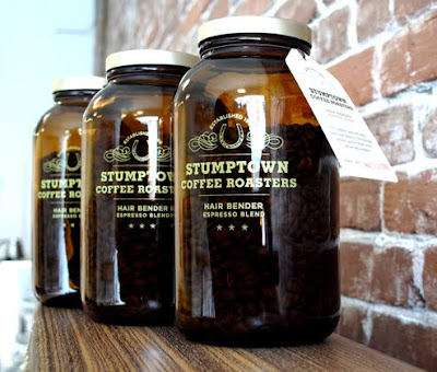
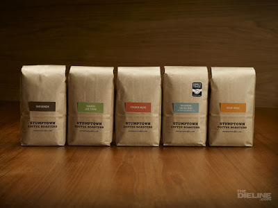
The amber glass for this special espresso blend hearkens back to the days of the general store and local apothecary. A vintage, homespun vibe goes along with Stumptown's brand ethos and really makes this product stand out, although without compromising the image of their usual brown paper packaging. It is also rare to see coffee beans in anything other than bags so the glass was a nice touch. Part of me wishes that this was pushed a bit more so that there was a different style of lid with texture or even laser engraving in the glass (like the example below).
Labels:
beverage,
package design
8.19.2010
MEMETIC CARTOGRAPHY
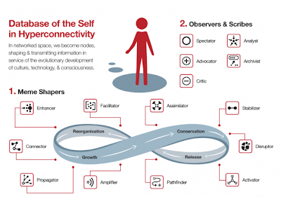
"Memetic Cartography" - concept mapping as evolutionary strategy; developed from the ideas of Charles Darwin and Richard Dawkins; a meme--like a gene--is an idea, belief, or pattern of behavior that is "hosted" on one or more individual minds which can then reproduce itself from mind to mind.
Conceptual framework for online identity roles by Venessa Miemis that shows how individuals interact with information online. She breaks the roles down into idea shapers, observers and scribes. This is a great example of how design is an important skill for information age data processing. Human brains are slowly having to adjust to interpreting data like never before: infinite quantity, organization, and synthesis. Welcome to the future.
p.s. check out those icons... so simple, clean, and direct!
Labels:
info design
8.10.2010
8.05.2010
INTERNATIONAL INFORMATION
Simplicity of digital design for the tram cars in Amsterdam. Just the bare essentials. In equal weight for visual unity.
Labels:
info design
ANOTHER CEO GOT BORED
The package re-design for Ciao Bella gelato is rather saddening. The previous design stood for something with its unique stark, simple packages that communicated by color and type. This new design seems to say, "Hey guys, look, I'm a real ice cream! Just like you! Look at my pretty photos!" While the category is a crowded one, there are not many deliberately Italian brands. The gelato found in Europe is really quite good and different from the ice cream in the U.S. To give that away for a visually crowded, origin-generic design is a resignation and a big part of the brand equity has been scooped away. Too close to Edy's and too far from Talenti.
Labels:
package design
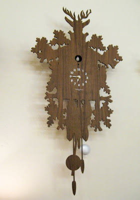
DUTCH DESIGN: CUCKOO CLOCK
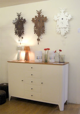
Human beings have always loved little birds popping out of boxes to remind us of the time. Automaton bird clocks came into fruition in the middle ages, but they gained steam in the early 18th century in the Black Forest in Germany. In the mid-19th century, expert woodcarvers created chalet-style casings with rich ornamentation carved three-dimensionally. This type of cuckoo clock--derived originally from the "Jagdstuck" design--has been popular since the mid-19th century and traditionally features hunting motifs such as deer heads, leaves, pine cones, guns, and oak foliage. The cuckoo clock has been a loved piece of kitsch for centuries.
The above cuckoo clock is a modern one in the style of the traditional clocks that was spotted in Dutch design heaven, The Frozen Fountain. Even though we want to reduce our surroundings for clean interior design as modernity almost mandates, we still want this kitschy decoration on the wall. With digital timekeeping, wall clocks are becoming irrelevant for time and relevant to interior design. The design of this clock has been stripped down so that as few details as possible are presented: wood, hunting motives, and the cuckoo bird.
The cuckoo is, of course, the most interesting part. Sound and spectacle. Why do we love to have a part come alive to remind us of the time?
Labels:
package design,
sculpture
7.11.2010
6.09.2010
6.06.2010
FIRE IT UP (SUMMER EDITION)
Innovation of the outdoor kind: a stylized gas fire pit fabricated from raw steel with handmade details such as peeling bark, pine cones, leaves, and twigs. Since it is handcrafted, this item takes on a sculptural quality to nearly pass as a work of art. The exaggerated vertical arrangement and inclusion of details such as twigs and leaves makes this a very unique piece that emphasizes the ferociousness of the flame. But it is not too ferocious -- the flame is not from the wild strike of a match or the breath of a hot ember, but the controlled flip of a gas switch.
Labels:
sculpture
5.31.2010
BOYLAN'S BIRCH BEER
Boylan's Birch Beer is the original drink developed by the Boylan soda company back in 1891. Their sales increased during the silly prohibition era, as the company decided to package their soda in unused beer bottles. Now, in a time where so many companies change their visual and/or packaging identities every few years when the CEO gets bored, Boylan's still uses the design inspired by their original bottles. No paper labels here. Just two colors and glass molding. The result is a solid brand that has a permanent seat in your mind as the vintage soda.
5.01.2010
4.27.2010
GET OFF THE PHONE
This print ad for the Bangalore Traffic Police created by the Mudra Group in India is a refreshing new angle on the effect that the product/problem has on its participants. A public awareness ad could communicate a common formula like: "if you talk on the phone while driving, this bad thing will happen to you." Or, as this ad does, it could communicate: "if you talk on the phone while driving, this bad thing will happen to the person you're talking to." We are reminded that car accidents resulting from distracted drivers are not just the fault of the driver.
The concept is good because it is unexpected. However, the art direction could use more work in composition and staging. The desaturated tones of the image allow the red blood to stand out, but the blood itself could use an increased level of gore by being a bit heavier and thicker, maybe even with some clots, since it looks like thin paint as it is now. Compositionally, the diagonals of the blood line, the arm, and the side of the woman's body effectively guide the eye from the focal point of the phone. The only problem is that the woman seems distorted from the angle of her head, as the hairline is uneven and is shaped to make the head appear elongated. It is really is quite annoying once you notice it. Also, her expression could use a touch of disgust. Check out this other execution in the same campaign.
Labels:
ads
4.25.2010
ME-OWWW
Since the cat (or "dog") doesn't actually purchase a bed for itself, it could be argued that pet owners project certain fantasies or idealizations onto the bed they buy for their pets. What could their therapists wrestle out of these owners' subconsciousness?
Top Row, Left to Right
• "You're not really a cat. More of a cat fish. I love taking embarrassing photos of you to make myself seem comedic."
• "Scurry into the glory hole like a good kitty!"
• "I refuse to buy any furniture that is not featured in Dwell magazine."
Middle Row, Left to Right
• "Form always trumps function. Now we have matching beds!"
• "I stole this from MoMA."
• "Well you seem to have no trouble jumping up ten feet to sit atop the refrigerator."
Bottom Row, Left to Right
• "If you run away I could use this as a shoe brush."
• "Tee pees are so underrated."
• "My flatbed scanner is now officially your bed."
Labels:
design
4.17.2010
YEE HAW, MOTHERFUCKER
The Western is the most enduring and most successful Hollywood genre in history. John Wayne. Robert Redford. The Williamsburg Hipster. The cowboy represents the desired image of America by embodying a specific set of traits.
Independence
Autonomy
Ownership
Strength
Virility
ProtectionBut the cowboy is not unique to America. It evolved out of the medieval English knight. Our cowboy -- that we have constructed and shaped to our needs since the turn of the 19th century -- is an archetype that furthers a dominant ideology. What these figures do is provide a central icon around which to establish an identity as a nation. The cowboy offers a myth that seems to substantiate the ideology behind it, which is certainly capitalist. At the turn of the 19th century America needed to cultivate an idealized self-image characterized by the individual, self-reliant, transient qualities of the western hero in order to further capitalism as the dominant ideology. The myth prevails and masks the violence of the West, class and racial unrest in America, and capitalism’s control over American culture.
Cowboy boots. So damn American. We wear them as aspirational participants in the myth in considering ourselves to be strong, independent people. And maybe we like seeing them because at some level we like to feel that we have a strong, independent leader to take ownership of us and protect us against the evils in our lives.
MOTIVATIONAL POSTER
We all have seen motivational posters (especially if you watch The Office) with self-help adages. They're blatant pieces of propaganda designed to propagate action for the self within a specific environment. We are supposed to be encouraged by an image. On one hand it is the satisfying recognition of the power of art and design. But on the other hand it is a forced way of manipulating ourselves vis-à-vis a visual substitution for a voice above us. Perhaps we should consider who is telling us to conceive, believe and achieve. The wall? The designer? Your boss? Your company? Your god? Your superego?
Or is it all a subconsciously accepted sham and therefore really just a pretty poster on the wall? So the better looking, the more motivating (i.e. the image above). Since we intellectually know it is a poster designed to motivate us, do we nod in acceptance and focus back on our present task? Or do we use it to justify our slacking?
Conceive, believe, and achieve. The design of the image above is decadently polished with the simple but strong color palette of medium blue, steel gray, black and white. Blue. It is one of the most popular colors for design, especially for banks and law firms. Psychologically, it conveys trust, which makes sense in the context of motivation. Visually, the blue in the design above is a particular shade of blue that does not saturate the eye's cones, but rather softly eases in to sit comfortably with the white and light silver. There are many hues of blue out there, however most blues we encounter are of the common medium-navy, ocean blue type (such as that of Blogger, the New York Knicks, NYPD -- the kind that looks atrocious when paired with orange). One theory on the pervasiveness of this particular blue is that it is close to the Crayola crayon blue that we all encounter in our first decade of life and therefore somehow feels "right."
The custom typography is that of a solid sans serif letter form with lines of equal weight; it is reminiscent of French enamel signs from the 1930s. The type has the feel of retro medicine drugstore bottle meets galactic space invaders, which are two opposites that posit old/antique with new/futuristic. This could make the poster work on a deeply subconscious level by easing our minds into a happy middle place found between that dichotomy.
Labels:
design
4.02.2010
STORY TIME: DATE NIGHT
EXT. CAFE IN PARIS, FRANCE 1896 - EVENING
WOMAN
My, this is so lovely!
MAN
Yes, it's one of Paris' finest cafes.
MAN
Garçon, one cognac for me and an absinthe for the madame.
Enter WAITER with drinks
WOMAN
Oh, this, what is it, absinthe, has a very curious taste.
MAN
Yes, it's good for you. Here (nudges cognac across table), now try this.
MAN leans on elbow on table and grins cunningly
MAN
Drink up, darling, drink up.
FADE OUT
WOMAN
My, this is so lovely!
MAN
Yes, it's one of Paris' finest cafes.
Enter WAITER
MAN
Garçon, one cognac for me and an absinthe for the madame.
Enter WAITER with drinks
WOMAN
Oh, this, what is it, absinthe, has a very curious taste.
MAN
Yes, it's good for you. Here (nudges cognac across table), now try this.
MAN leans on elbow on table and grins cunningly
MAN
Drink up, darling, drink up.
FADE OUT
3.31.2010
3.25.2010
3.19.2010
3.17.2010
HOLY MISE-EN-SCENE
This stop-motion animation-style video by the director "Pes" (a.k.a. Adam Pesapane) for the Washington State Lottery is delicious. The colours are so luscious and the palettes of each scene are harmonious in their simplicity. Also, this video is a great example of reappropriation (one of the post-modern principles of art) in its utilization of everyday objects as landscape settings and props. For example, white rubber gloves as snow on the mountain, pine cones as trees, and lunch box as barn.
Subscribe to:
Posts (Atom)